

An end-to-end product case study on clarifying conversion rates, manual credit transfer, proof submission, and transaction status.
Converting unused cellular credit into money sounds simple until the user has to do it. The person choosing a rate is also entering a phone number, selecting a bank destination, sending credit through a separate phone action, uploading proof, and waiting for a result. Each step raises a practical question: Is this the right provider? How much will I receive? Has my transfer been recorded? What happens next?
I explored Viapulsa's mobile journey as a Product Designer, from studying the existing experience and framing the user problem through flow design, sketches, high-fidelity screens, and usability evaluation. The design goal was to make the necessary transaction steps understandable and give people a clear way to check their progress. This case study follows the decisions behind the screens, including the operational questions that a polished interface alone cannot answer.
🧭 Project Context and the Transaction Problem
What the service asks a user to do
Viapulsa's central task is to exchange cellular credit, or pulsa, for money sent to a bank account or a wallet. The mobile experience also presents bill payment and digital purchases. Those adjacent services make the homepage broader than a single-purpose conversion form, but credit conversion is the journey examined here.
My scope covered the existing app review, research synthesis, persona, customer journey, information flow, paper wireframes, high-fidelity mobile screens, prototype exploration, and usability testing described in the project. The output was a connected design proposal for the mobile app. This case study focuses on what that design shows and what the recorded evaluation can support.
The transaction has two kinds of work. Some actions take place in the interface: entering details, reading a rate, choosing a destination, and submitting proof. Others depend on an external cellular transfer and subsequent verification. Removing a form page would not remove that dependency. A user could finish the visible fields and still be uncertain whether the transfer succeeded.
What the existing screens revealed
The older interface presented a route through intro and registration, a homepage with provider-rate cards, a provider-specific conversion form, bank information, transfer instructions, processing, and success. The screens made the steps available, but they dispersed key decisions across the journey. A user encountered the conversion rate and amount in one place, banking information in another, and the manual transfer at a point where the transaction already felt underway.
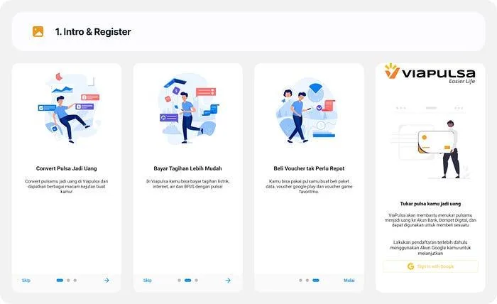
The existing intro and registration screens establish the entry experience reviewed in the study.
The existing homepage and conversion views showed provider rates, followed by a provider-specific form. The rate was visible, which was useful. The friction was in carrying that choice into the conversion task and understanding whether the phone number, provider, and received amount agreed. The problem was not simply the number of taps; it was how much the user had to infer before committing.
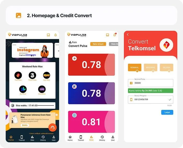
The existing experience displayed rates and a provider-specific conversion path; these screens are the baseline, not the proposed HiFi.
Bank destination was another trust-sensitive moment. The existing screens collected the receiving account and showed transaction details, but a user still needed to understand which account would receive the money and whether that information could be checked before the external transfer. A clearer journey had to make that verification deliberate rather than merely add another field.
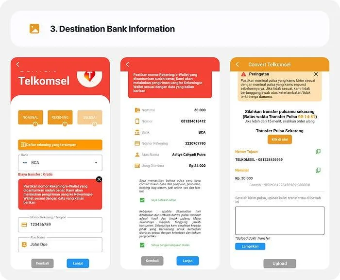
The bank destination screens show where account confidence became part of the conversion task.
The transfer and processing screens revealed the hardest handoff. The user had to send credit through a phone mechanism, return to the app, provide proof, and wait. From the interface alone, selecting a screenshot and having Viapulsa receive and verify it are different states. A successful-looking visual cannot bridge them unless the underlying service can acknowledge each transition.
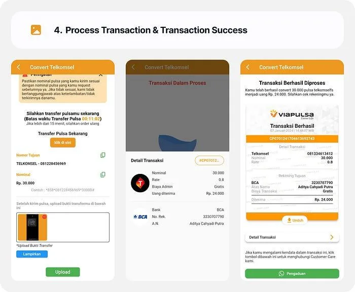
The existing completion path helped identify where instructions, proof status, and a final receipt needed clearer meaning.
Framing the design question
The project description identified long and confusing steps, inconsistent feedback, and uncertainty about transaction status. Its business ambition was to improve the service experience and attract more users; the design problem was narrower and more actionable. How could the mobile flow help someone make an informed conversion decision, carry out a manual transfer correctly, and know what the system had received and processed?
That question led to three design priorities. First, show the expected exchange before the user enters a commitment path. Second, validate information when the user provides it. Third, keep the transfer and processing states distinguishable so that neither a selected file nor an animated confirmation is mistaken for a completed financial transaction.
🔎 Research and Experience Definition
Inputs and the limits of the record
The study described interviews with potential and existing users about their behavior, expectations, and frustrations with pulsa conversion. It also described a task walk-through of the existing app. The reported themes were convenience, speed, and security, alongside frustration with the flow's length, terminology, and feedback. The available materials do not include interview transcripts, participant count, task script, or a frequency ranking for those themes, so I treated them as directions for design rather than quantified findings.
Convenience had a concrete meaning in this journey: a person should be able to tell which information matters next without reconstructing the entire conversion service. Speed meant avoiding repeated selection and unnecessary re-entry. Security meant an understandable exchange, identifiable destination, and an auditable outcome. The interface could support these needs by making the state of the task visible. Whether that would improve real transaction behavior required separate evaluation.
Dina and the decision she represents
Dina Adelia was a research participant whose profile informed the study. Her recorded scenario described a 28-year-old government employee in Jakarta who occasionally converts credit and may need a record for work-related reimbursement. This is one participant's context, not a claim that every Viapulsa user shares the same occupation, frequency, or motivation.
Her situation made the design question more precise. A user converting money for a reimbursable expense needs to identify the receiving account, understand the amount, and keep proof of the transaction. A screen that merely looks fast is less useful if it cannot answer those questions. I used this context to inspect the journey from before conversion through confirmation, especially the point where the task moves outside the app.
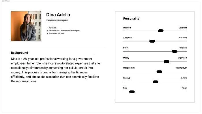
Dina's profile provided a concrete task context for the design; it is not a representative sample of all users.
Mapping the confidence gaps
The customer journey map organizes onboarding, form entry, the transfer wait, processing, and success. It makes the transition from an in-app form to an external phone action easy to inspect. The map's quotes, emotion line, exact times, and future opportunities are scenario devices used to reason about the design, rather than direct observations or measured emotional scores.
The useful insight is the location of the questions. Early in the journey, a user asks whether the product and rate are worth considering. In the form, they ask whether the app has understood their number and destination. At the transfer step, they need to know what action to perform and whether their proof was received. After submission, they need a status that distinguishes waiting from a confirmed result.
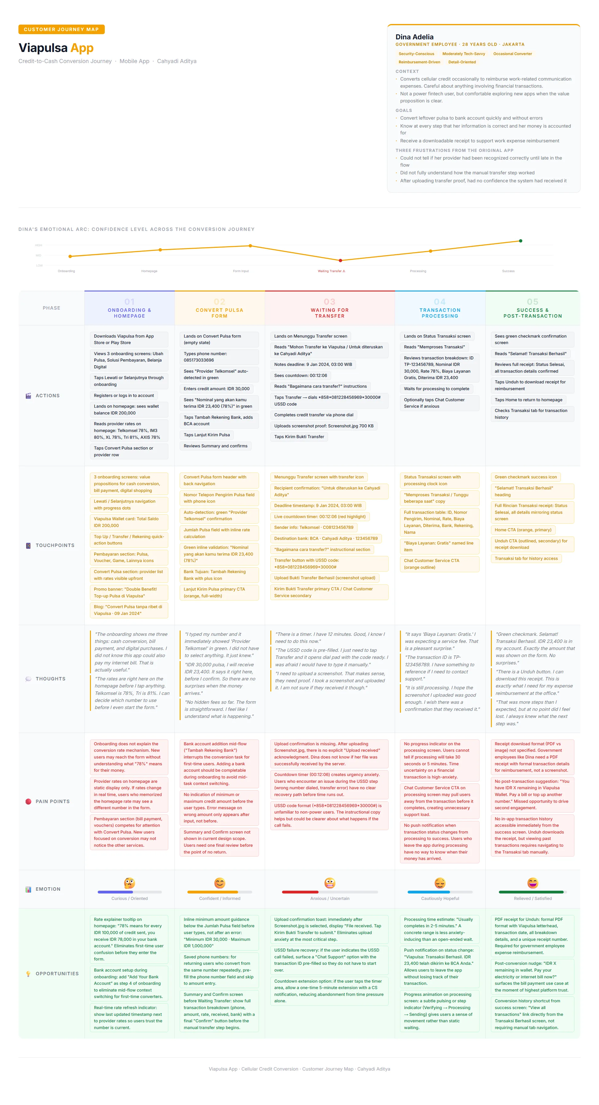
The CJM connects the transaction steps to user questions and possible failure points; its thoughts and emotional arc are illustrative.
The journey map also revealed a tension in the design. A countdown can make a deadline visible, but it can raise pressure if the external transfer fails or support is slow. A receipt action can help someone keep a record, but only if the status and details behind that receipt are dependable. These are not reasons to hide the controls. They are reasons to design recovery and service rules alongside them.
🗺️ From Findings to Flow
The design choices behind the sequence
The project used a design-sprint structure to move from problem framing to sketching and a testable proposal. The documented ideation included simplifying the flow, adding clearer guidance, saving details for later use, and making transaction history and receipts accessible. Rather than treating each idea as an equal feature, I connected them to the conversion decision: what helps a first transaction proceed with less uncertainty?
The resulting flow kept an entry path from onboarding to the homepage, then brought the user through rate visibility, phone and amount entry, bank destination, a summary, manual credit transfer, proof submission, processing, and result. The historical article described provider selection as a separate early step. The proposed screens instead show a phone number entered first, followed by inline provider detection. That change removes a deliberate selection only if the detection is accurate and the user can correct an error.
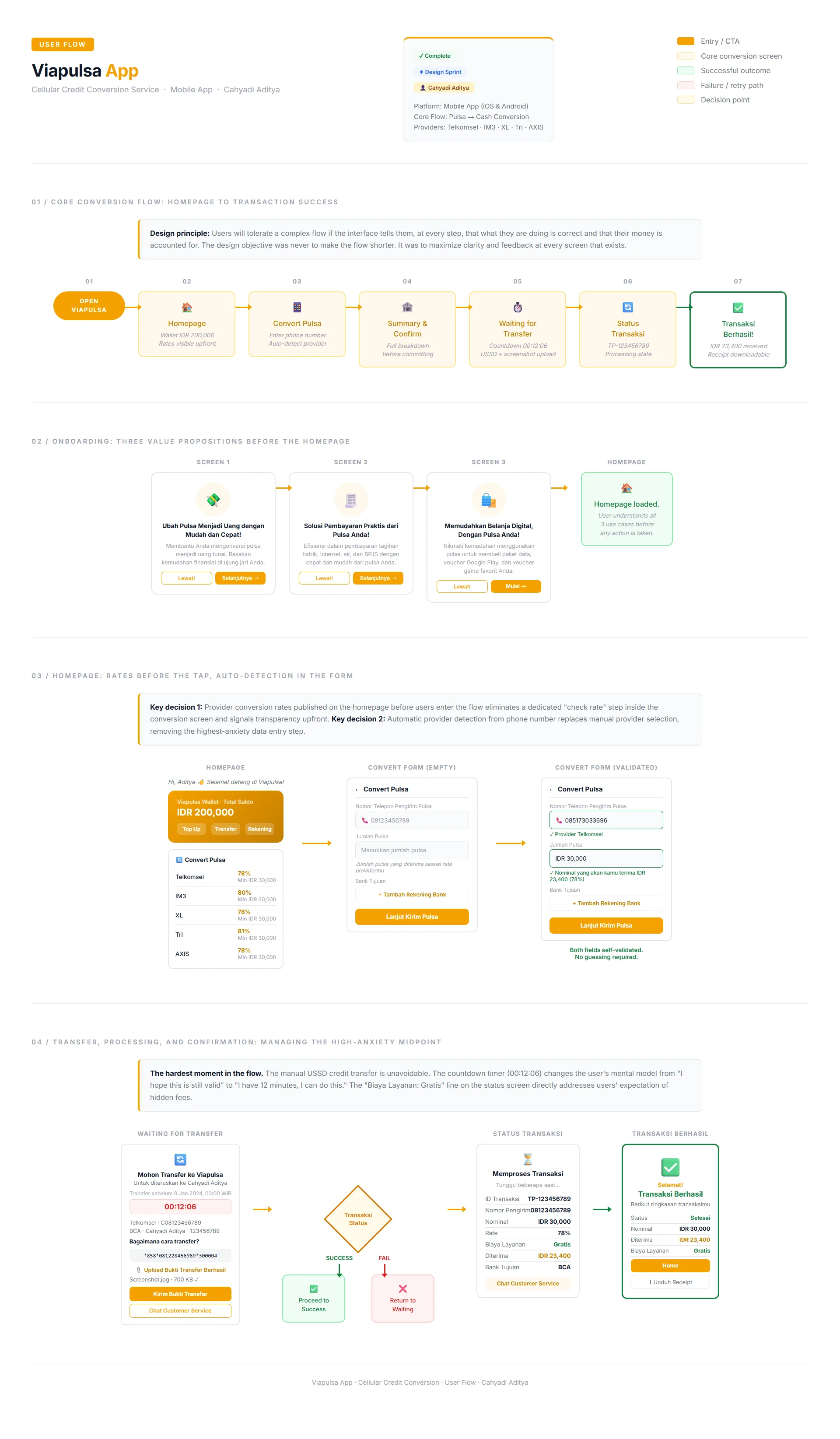
The user flow describes the intended interaction path. Its success, failure, account, and timing states are design scenarios.
The flow also makes one omission visible. It shows a route toward success and a simplified retry path, but it does not fully specify an expired timer, a failed USSD transfer, duplicate proof, an incorrect destination, or a transfer that arrives after the screen times out. Those are service decisions to resolve before a working product could safely use the visual path.
What the paper sketches established
The paper wireframes explored the splash and home experience, conversion entry, and transfer/detail views before high-fidelity styling. Their value was structural: they made the relationship among navigation, wallet information, conversion, and proof/status visible while changes were still cheap. A sketch did not validate whether the system could detect a provider or process a transfer; it showed where those capabilities would need to communicate with the user.
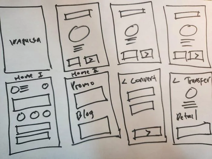
The sketches precede the final visual design and expose the main page relationships.
The design sequence can be read as a set of linked decisions. Onboarding would orient a first-time user. The homepage would expose rates before the form. The form would confirm number, provider, amount, and destination while the user could still correct them. The transfer view would give a deadline and clear action. Processing would keep the reference details visible. Success would close the loop with a record. Each screen had to answer the question left by the previous one.
📱 High-Fidelity Design and Interaction Reasoning
Onboarding: explain the service before asking for trust
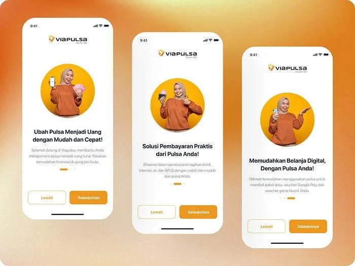
The proposed onboarding keeps three focused screens. One introduces converting pulsa to money. The next places bill payment in view. The last explains digital purchases using credit. This order matters because a person arriving for conversion should encounter that value first, while the broader service still gains a place in the product map. The screens include skip and next controls, so orientation remains available without becoming a compulsory lecture.
The trade-off is attention. Three propositions can clarify the product, but a user with an immediate conversion task may prefer to enter directly. Onboarding is therefore an introduction, not evidence that people understood the service. The more consequential explanation is the one available where a decision is made: the rate and expected amount.
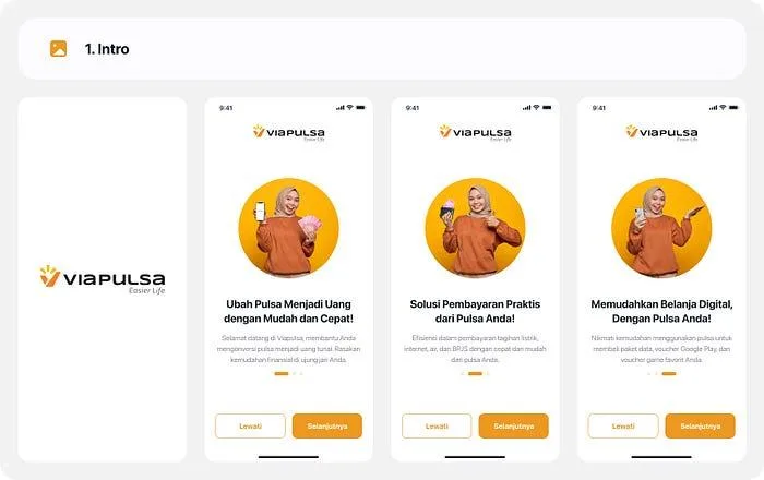
The proposed onboarding introduces conversion first, followed by adjacent payment and purchase use cases.
Access: make account entry legible
The login and registration screens establish a familiar route into an account-based financial task. The designs show sign-in and sign-up forms, password visibility, and supporting prompts. Those patterns matter here because transaction history, saved destinations, and downloadable records would all need a reliable link to the right person. The screens express the intended account entry; they do not establish that identity, consent, or security controls were implemented.
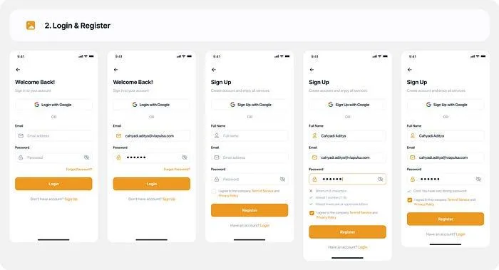
The login and registration HiFi gives the conversion flow a recognizable account entry point.
Homepage and form: put the exchange in view early
The proposed homepage combines a wallet card and payment shortcuts with a Convert Pulsa section that lists provider rates. In the screens, Telkomsel and XL are shown at 78%, IM3 at 80%, Tri at 81%, and AXIS at 78%, with a minimum of IDR 30,000. These are values in the design artifact, not a current rate card. Their role in the story is to show what information a person can inspect before starting a conversion.
This is a useful product decision because the rate is part of the user's choice, not an operational detail to reveal at the end. At the same time, publishing it on the homepage creates a dependency: the displayed rate, the rate used in the form, and the eventual payout must agree or explain why they changed. Transparency is only credible when it is maintained across states.
The form moves from a separate provider-selection action toward phone-number entry with inline detection. A green confirmation beneath the example number identifies Telkomsel. The user then enters IDR 30,000 and sees an illustrated payout of IDR 23,400 at 78%. The calculation is straightforward, but its timing is the design point. It appears before the user leaves the form to perform an external transfer.
The green state is not a substitute for a correction path. A person must be able to recognize a mismatched provider or an invalid number, and the form must show what can be changed. The proposal communicates a successful state; error resolution would require more design and validation.
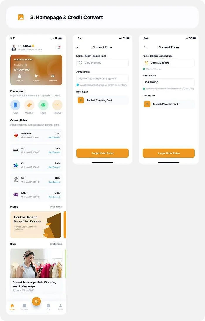
The HiFi places provider rates on the homepage and an expected payout beneath the entered amount.
Bank destination: check the receiving side before the handoff
The bank screens show a choice among banks and an option to add account information. A returning user could select a saved destination; a new user could enter one. This is a narrower improvement than simply asking for fewer fields. It puts the payout destination into the same decision sequence as the number, rate, and amount. A wrong bank account can be more consequential than a few extra seconds of form time.
The proposed path still needs a reliable confirmation of account ownership and a clear way to edit details before transfer. The visible mockup shows selection and entry, but not the underlying bank validation. I would not treat the presence of a bank logo as proof that the account is valid or that funds can be delivered.
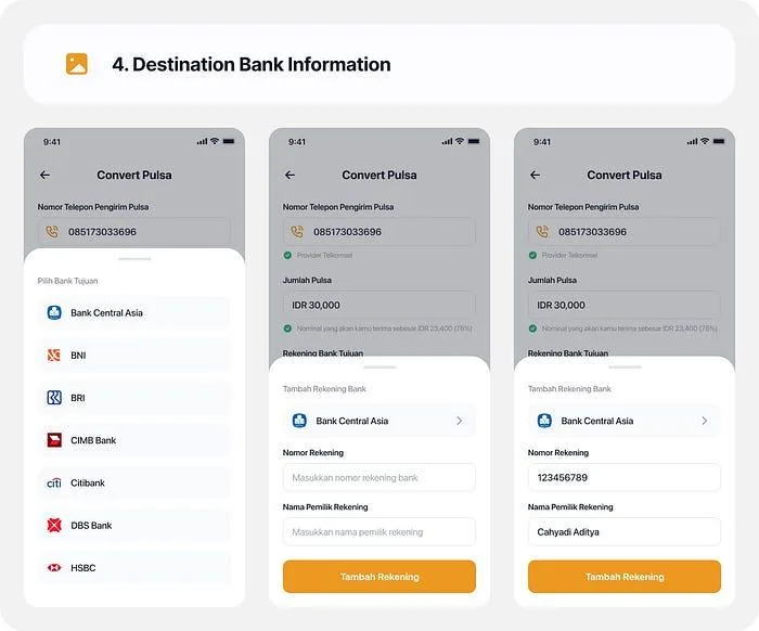
The bank destination screens place payout details in the user's review path before the manual transfer.
Transfer: make the external action explicit
The waiting state carries the most interaction risk because the next meaningful action happens outside the ordinary app flow. The design shows who the credit is being sent to, a bank destination, an example deadline and countdown, transfer instructions, a transfer action, proof upload, and customer support. Those elements answer different questions: what to do, by when, how to return, and where to ask for help.
The countdown displayed in the screen provides a visible task window. It could help a user prioritize the transfer, but it could also create avoidable pressure if the clock is not synchronized with the service's actual acceptance window. The time shown in a static design is not evidence of a working timer or an operational cutoff. The product would need to define when the timer starts, what happens at zero, and how a delayed transfer is reconciled.
The screen also distinguishes choosing a proof file from sending it. A selected screenshot is only local to the device until the service acknowledges receipt. The primary submit action and the later processing view should communicate that transition in words a user can recognize. Otherwise the most reassuring part of the design would be an illusion at the moment the user most needs certainty.
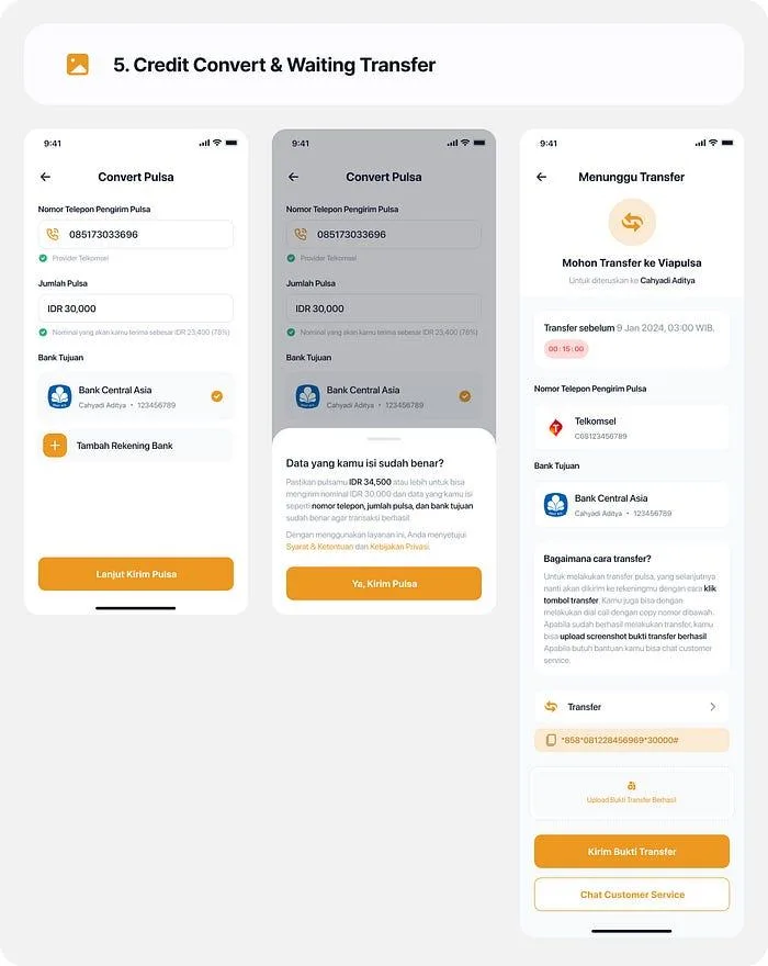
The waiting view combines transfer instructions, a deadline example, proof upload, and support access around the manual step.
Processing and success: close the visible loop
The transaction status screen shows a reference ID, sender number, nominal credit, rate, service fee, received amount, and bank destination. The design includes a named service-fee line marked “Gratis.” That line is useful because it makes the calculation inspectable; it should be read here as a screen example, not as a current fee promise. The processing state also offers a path to customer service.
The success view uses a distinct green confirmation and repeats the transaction summary. It provides Home and Unduh actions. Repeating the data helps a user compare the result with what they saw before the transfer, while the receipt action addresses Dina's need for a record. The mockup demonstrates the desired information architecture; it does not verify that a payment was made or a receipt file was generated.
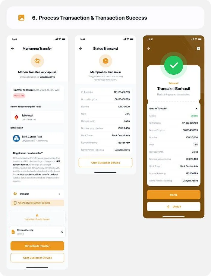
The proposed result screens keep the transaction breakdown visible and provide a receipt action after success.
Across these screens, the HiFi output solves a communication problem in the journey. Rates move earlier, form values receive inline feedback, transfer instructions become more explicit, and the result has a reference. A production service would still need the data and operations behind each displayed state. That distinction shapes both the evaluation and the next product decisions.
🧪 Evaluation and Design Outcome
What the recorded test says
The project write-up reports a usability test in which people performed a cellular credit conversion task with the redesigned app. It reports an average task time of seven minutes for the earlier experience and four minutes for the redesign. That is a useful directional result within the author's study record. The available materials do not provide participant count, individual task times, task definitions, whether external transfer time was included, or the comparison conditions. I therefore would not turn that result into a claim of statistical significance, revenue growth, or real transaction completion.
The design artifacts themselves support a narrower conclusion that is still valuable: a user can be shown the rate and received amount earlier, can see a clear manual-transfer instruction, and can inspect a transaction reference and receipt action in the proposed interface. The usability report suggests that the task may have become faster in its tested setting. It does not isolate which screen caused the difference, and it does not show whether the service would complete actual transfers more reliably.
What the project produced
The completed design output is a connected mobile proposal: onboarding and account entry, rate-aware homepage, validated conversion form, bank destination, transfer guidance, proof submission, processing details, and success. The source HiFi remains the output shown here. This case study adds reasoning about the decisions and their operational consequences; it does not require changing the original screens to tell a more rigorous story.
The strongest product insight is that the most consequential interaction is not necessarily the one with the most fields. It is the handoff between a user's external credit transfer and the app's acknowledgment. The redesigned interface makes that handoff easier to understand, while its unresolved states show where a working service would need more specification and testing.
🚀 Further Enhancements and Product Considerations
Define the reliable core before expanding features
If I were taking this design toward a working service, I would start with a narrow conversion path: one supported provider and payout route, current rate retrieval, detectable or correctable provider selection, amount validation, a review step, explicit transfer instructions, proof receipt acknowledgment, and a result tied to a persistent transaction ID. A limited scope would allow the team to test the service handoffs rather than hide unresolved behavior behind a wider menu of features.
The first operating agreement would be about states. “Proof selected,” “proof uploaded,” “credit received,” “verification in progress,” “payout initiated,” and “payout completed” are different events. The screen should never collapse them into a single reassuring message. The service would need a record for each transition, with timestamps and a support view that uses the same reference ID the customer sees. This is the foundation for credible status copy and a receipt.
Specify recovery at the manual-transfer boundary
I would next design the paths omitted by the happy-flow screens. A failed USSD action should return the user to an actionable transfer instruction without losing the form. An expired timer should state whether an already-sent transfer can still be reconciled. A proof-upload failure should preserve the selected file when safe and offer a retry without starting a duplicate transaction. If a user sends credit twice, the service needs a way to identify and resolve the duplicate rather than issuing a second payout automatically or silently discarding it.
Provider detection and rates also need recovery. A phone number prefix can be ambiguous or wrong for a changed number; the app should expose a correction option and recompute the payout before commitment. When a rate changes between homepage and form, the product should show the new rate and require an informed confirmation. An incorrect payout destination needs validation or at least a review step before an irreversible action.
Privacy and receipt design belong in that core. Bank numbers and transfer evidence should be visible only to the parties that need them, and a downloaded record should clearly state whether it is a request, a transfer acknowledgment, or a completed payout. A polished PDF cannot compensate for an unverified financial state.
Measure task progress and operational load together
For a contained usability comparison, I would define the task clock before testing. It could start when a participant taps Convert Pulsa and stop when the participant reaches a valid proof-submitted state, excluding real payout processing. The denominator would be all attempted tasks, including abandoned and failed attempts. I would compare the same task, provider, amount, and device conditions across the existing and proposed interfaces. I would record completion, errors, requests for help, and whether participants can correctly explain the rate, payout, transfer action, and status. This would make a future timing result interpretable alongside task quality.
For an operational pilot, the main outcome would be the share of eligible conversion attempts that reach a correctly reconciled payout within the agreed service window. The denominator should include all initiated eligible attempts, not only those that submitted proof. I would track rate discrepancies, wrong-provider corrections, proof-upload retries, expired windows, unresolved transfers, duplicate attempts, support contacts per attempt, payout delay, and payout errors as guardrails. A faster form is not a success if it increases disputed transfers or support burden.
Only after the first conversion path is dependable would I explore saved numbers, saved bank accounts, rate alerts, transaction history shortcuts, bill payment prompts, and wallet-led repeat actions. Those are plausible opportunities in the existing design direction. They should follow demonstrated trust in the core service rather than substitute for it.
📝 Reflection and Takeaways
This project changed how I think about “simplifying” a financial task. Some screens can be removed; an external credit transfer and its verification cannot be removed through interface styling. The useful design work is to make the exchange legible before commitment, help a person act correctly during the handoff, and show what has actually happened afterward.
The existing and proposed screens make the progression visible. The earlier experience exposed many of the necessary steps. The new design moved rate and payout information forward, showed inline validation, and gave transfer and result states more explicit content. The reported usability result points toward a more efficient task in its study setting, while the artifacts reveal where accuracy, acknowledgment, recovery, and operational timing would determine whether that confidence survives real use.
If I revisited this work, I would begin with the proof-to-payout state model and its failure paths before adding more growth features. That is the decision most likely to determine whether the interface's promise can be trusted.
📌 Disclaimer: This was an independent educational design project, not an official Viapulsa engagement or a released product change. Dina was a research participant; the CJM's quoted thoughts and emotional arc are illustrative. Rates, accounts, timers, fees, transaction states, and receipts in the screens are design examples, not current offers or completed transfers. The task-time comparison is reported in the project article without underlying test records, and no production or business improvement is claimed. Brand and imagery belong to their respective owners.
💬 Let’s Connect: Have feedback or thoughts on this case study? I'd love to hear from you. Feel free to leave a comment below or explore more of my product and experience work at cahyadiaditya.site. For a discussion, reach me via Telegram or connect with me on LinkedIn. Thank you for reading.