

An end-to-end product case study on connecting entertainment content, merchandise discovery, and a trustworthy path to purchase.
A fan can be interested in a fictional world without knowing where to go next. They may encounter a comic on social media, recognize a character on a T-shirt, and still have to piece together where the story lives, what is available to buy, and whether the purchase path is reliable. That gap between attachment and action was the design opportunity I explored for Kara Guardian of the Realms, an Indonesian entertainment IP associated with Visi8 Studio.
I designed a desktop-first landing page and e-commerce experience that gave the world a clear entry point and connected it to product selection, cart review, delivery, payment, and an order confirmation state. The work produced wireframes, high-fidelity website screens, a customer journey map, and a user flow. The evaluation also recorded directional reactions from real usability participants.
The interesting design question was not whether atmosphere or commerce mattered more. It was how to let a visitor understand the Kara universe while preserving a direct route for a fan who already wanted to buy. The case study follows that decision from the initial inputs through the finished interface, then separates the observed feedback from what a production team would still need to validate.
🧭 Project Context and the Decision to Design
A website with two jobs
The project brief described Visi8 as the company behind Kara Guardian of the Realms and identified three content and product lines: digital comics, animation or movie content, and merchandise. It also identified the absence of a dedicated Kara landing page and e-commerce path at the time of the study. A visitor could be aware of the IP without finding a single owned place that explained the world and supported a merchandise purchase. The existing website may have changed since then.
I framed the design around two related jobs. The first was orientation: help an unfamiliar visitor understand Kara and the kinds of content and products attached to it. The second was purchase: help an interested fan compare an item, see the cost and fulfillment choices, and complete an order with confidence. Treating either job in isolation would miss the point of an IP-led storefront. A product grid can make a shirt purchasable while leaving the reason for the shirt unexplained. A world-building page can be beautiful while hiding the next action.
My work covered the current-state walkthrough, a desk review of comparable entertainment storefronts, journey and flow mapping, wireframes, and high-fidelity desktop screens.
A fan scenario to guide the design
I used Rafi in the customer journey map to test whether the design logic held together across the entire visit. He represents a Jakarta-based comic and animation fan who follows the story, wants to understand the merchandise, and prefers a payment method he trusts. His scenario gave the work a consistent set of questions from first encounter to checkout.
Rafi's journey exposed questions the interface should answer. What tells him that the comics, movies, and merchandise belong to one world? When does he have enough product information to choose? What would make the total and delivery options clear before payment? Those questions shaped the pages that followed.
🔎 Inputs, Research, and Problem Framing
What I could learn from the existing experience
I walked through the then-current Visi8 Studio landing page, performed tasks, and examined how someone would move through the available website. It was a useful way to identify the missing Kara-specific path. The study record does not include task scripts, a comparative baseline, screenshots for every state, or a frequency count for the frictions. I therefore treat the walkthrough as a design input, not a quantified usability finding.
The brief had a more durable implication than any one screen: content, merchandise, and payment needed a coherent route. I framed the core decision as a question: how might a site let someone enter Kara's world, discover a relevant product, and complete the purchase without making either storytelling or checkout an obstacle? That framing kept the design focused on sequence. First, a visitor has to know what the IP offers. Then they need enough product information to decide. Once they decide, the checkout should explain costs and choices without asking them to reconstruct context.
What the benchmark could and could not establish
I reviewed Warner Bros Shop and Disney Shop as references for entertainment commerce. The useful patterns were content-led browsing, visible product categories, related items, and a continuing relationship beyond one transaction. The benchmark also noted the risks of deep navigation and a catalog that favors physical merchandise while digital content is harder to find. Those observations do not prove those stores' current behavior, their conversion performance, or what Kara fans would prefer.
I translated the comparison into three working principles. Keep Kara's top-level choices legible. Make the relationship between story content and merchandise visible. Do not ask a visitor to join a community before allowing a direct shopping path. These principles were useful because Kara's proposed catalog was much smaller than a global franchise store. Copying a large-store information architecture would add complexity before it added value.
Three tensions to resolve
World-building versus immediate intent. A first-time visitor may need atmosphere and context; a returning fan may know exactly which T-shirt they want. The homepage needed to support both entry modes. This led to a visual hero paired with a clear Shop path, rather than a long narrative gate before commerce.
Product breadth versus understandable categories. Digital Comics, Shop, and Movies are different offers. Giving them comparable visibility helps visitors form a mental model of the Kara universe. It does not mean each category must have equal inventory or commercial value. The design had to show the breadth without pretending that every category had the same business model.
Brand expression versus transaction trust. Dark fantasy art gives the site character, but purchase decisions depend on ordinary details: product variant, total price, delivery, payment, and confirmation. The visual system needed to carry the IP through the journey while letting practical information stay readable.
Those tensions gave each screen a job: establish the world, help a fan find the right product, and make the purchase decision understandable.
🗺️ Journey, Flow, and Wireframe Decisions
Mapping the fan's full visit
I mapped the proposed visit from discovery and immersion through product evaluation, cart and checkout, and the post-purchase moment. The journey map helped connect decisions that would otherwise look like separate screen tasks. A person arriving from social needs to recognize Kara immediately. When browsing products, they need to know what each item is and what it costs. After an order, they need a clear confirmation before being offered more content.
The map also exposed dependencies outside the interface. A hero image can slow the page. A product card can look polished while its size or stock data is wrong. A bank-transfer option can be familiar to Indonesian buyers but still need reliable payment confirmation. An order confirmation screen is credible only if the transaction and follow-up messaging are real. These are product questions, not decoration decisions.
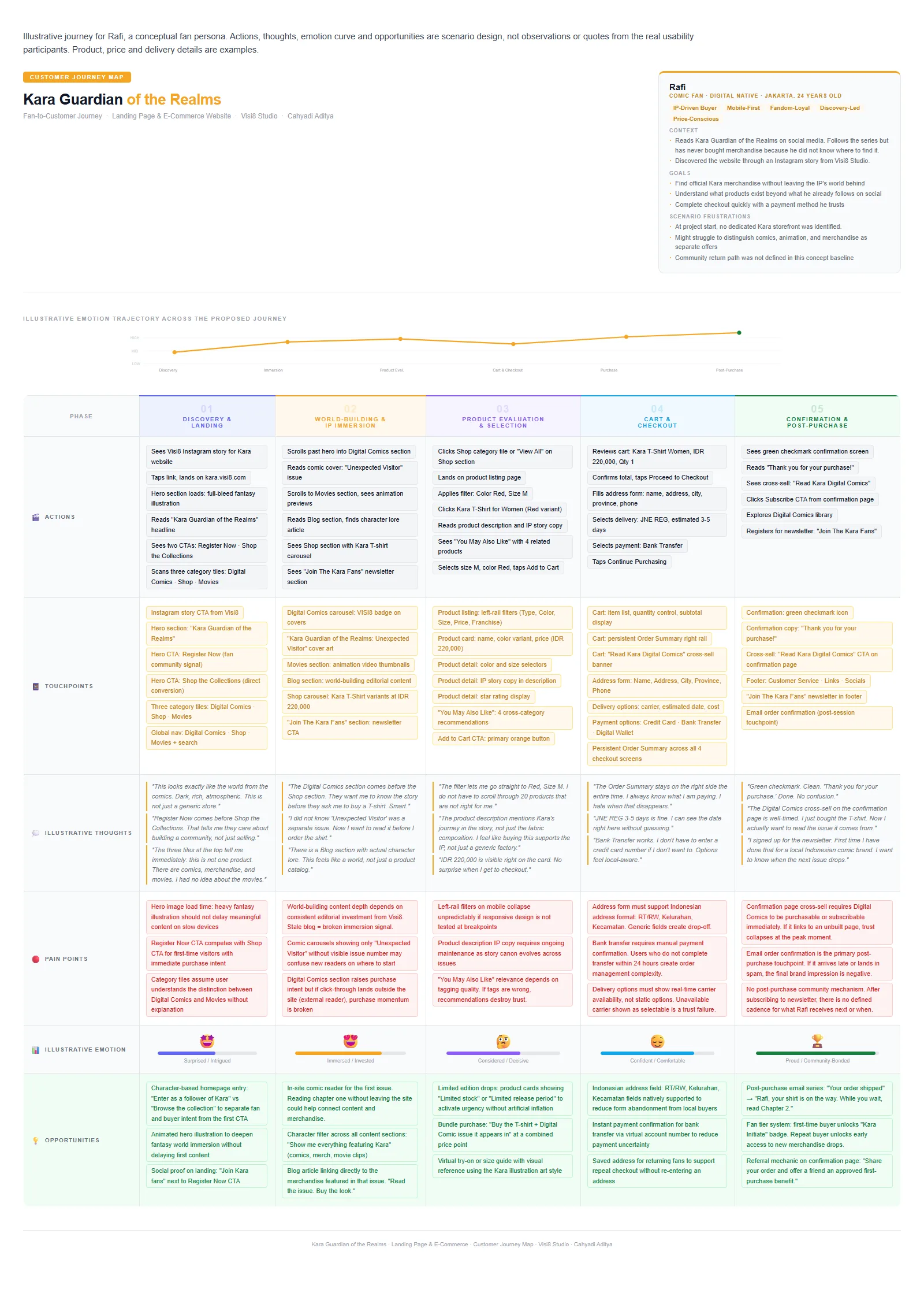
The CJM follows Rafi from discovery and immersion through product selection, checkout, and the post-purchase moment.
Two entry paths on one site
The user flow distinguishes an exploring visitor from a returning fan. The exploring visitor encounters the hero, scans the three product categories, reads or watches content, and may later enter the shop. The returning fan can use Shop or search from the main navigation and move directly to a listing. This is a difference in intent, not a fixed classification of people. The same person can explore on one visit and arrive ready to buy on another.
I treated those paths as parallel routes into one product system. If the first route requires registration before shopping, it risks blocking an immediate purchase. If the second route strips out all story context, the shop becomes generic. The landing page therefore offers Register Now and Shop the Collections together, while the persistent navigation makes Digital Comics, Shop, Movies and search visible.
From there, the commerce path continues through listing, product detail, cart, address, delivery and payment, and an order confirmation state. The flow diagram also shows a post-purchase route back to comics, connecting the merchandise decision with Kara's story content.
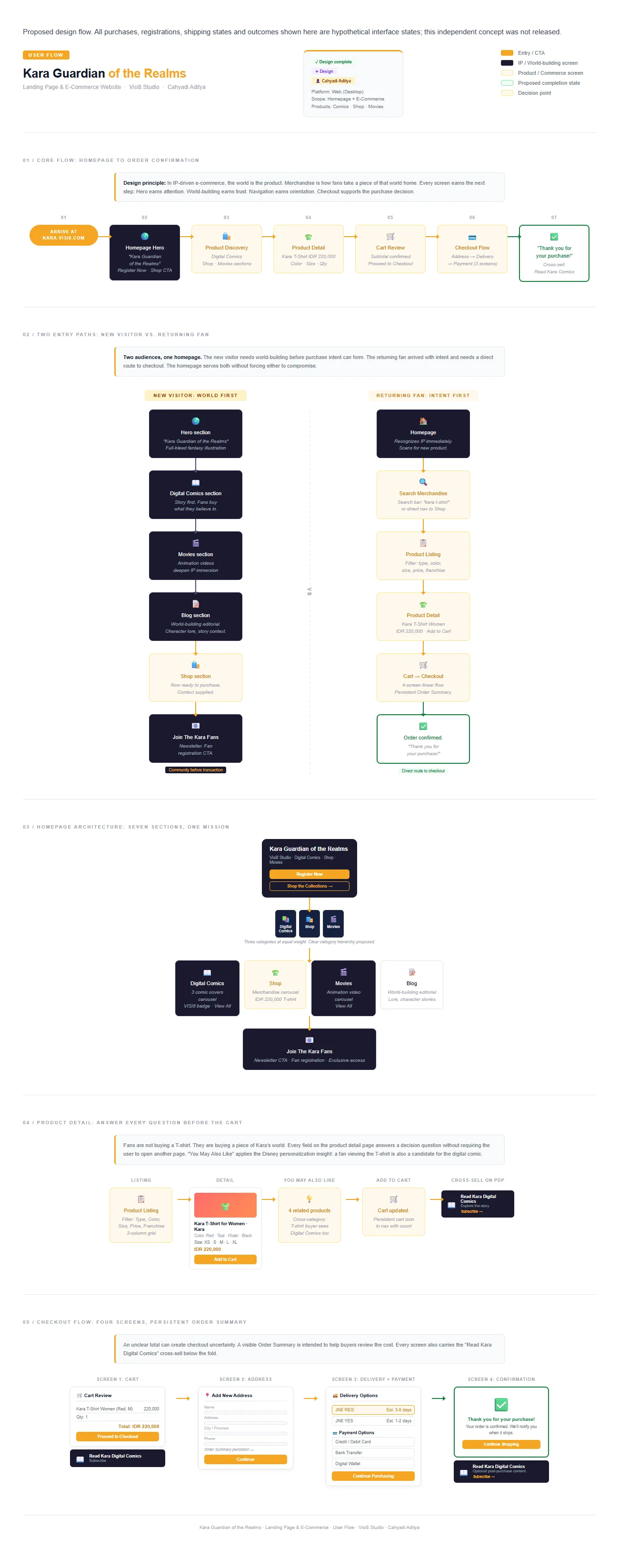
The flow makes the two entry intentions and the checkout sequence explicit.
What the wireframes resolved before visual design
The low-fidelity work tested page hierarchy across the homepage, listing, product detail, and checkout. On the homepage, it reserved a strong hero and then arranged content blocks for Digital Comics, Shop, Movies, Blog, and the fan invitation. On the listing page, it explored filters beside a product grid. On the detail page, it made room for variant choice, price, descriptive context and related items. In checkout, it kept the buyer's order visible while changing the task from review to address and payment.
This stage mattered because the information architecture was doing the heavy work. A fantasy illustration could make almost any page look compelling at first glance. The wireframes forced a different question: if the artwork were removed, could a visitor still find a comic, identify a T-shirt variant, and understand the next step? The final screens retained the same basic sequence, with the art and dark visual language added around it.
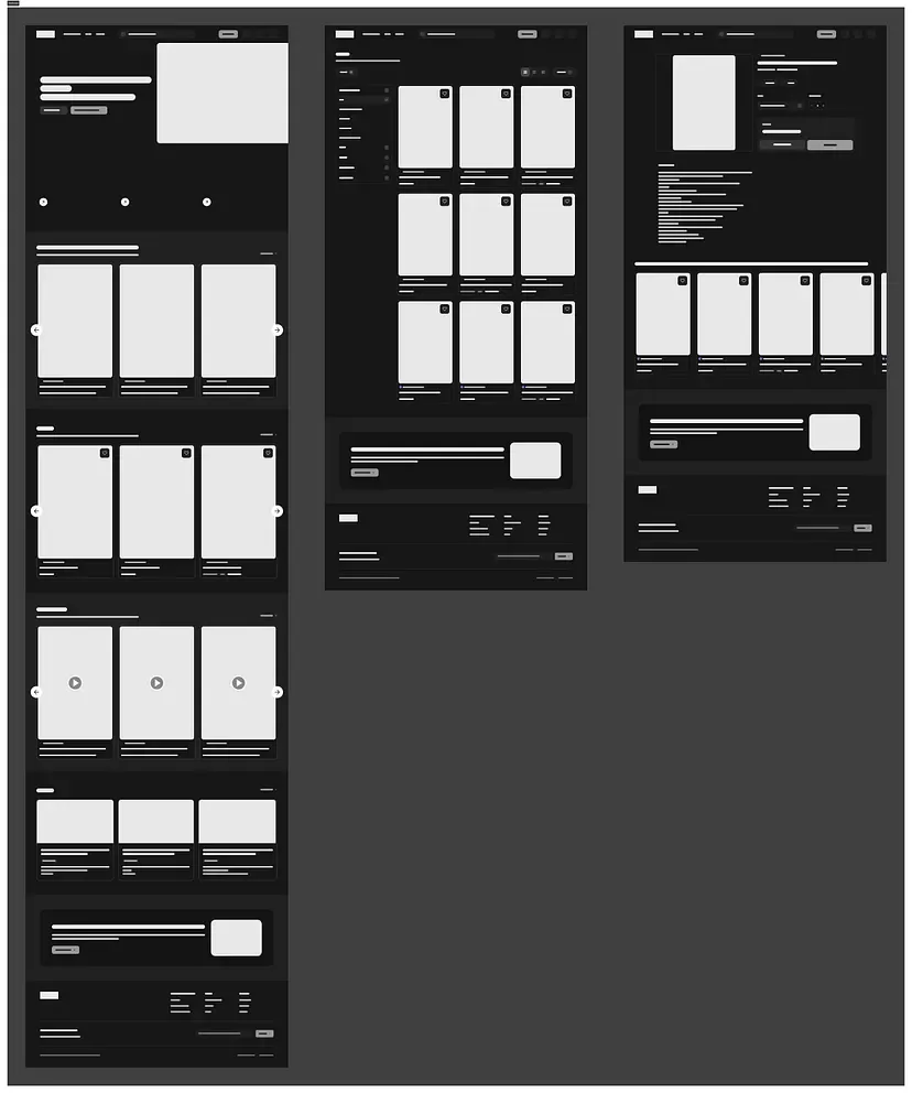
The wireframe collage shows the page-level structure that preceded the high-fidelity concept.
🖥️ High-Fidelity Design and the Reasoning Behind It
Homepage: make the world legible without hiding commerce
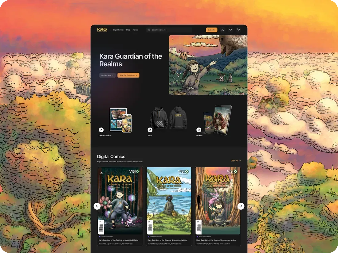
The hero uses a fantasy illustration and a dark surface to establish the character of Kara before asking the visitor to parse products. Two calls to action sit in view: Register Now and Shop the Collections. The first opens a relationship path; the second serves immediate purchase intent. I did not assume registration would outperform shopping or deserve priority for every audience. The design makes both routes visible so their roles can be assessed rather than hard-coded as a gate.
Below the hero, Digital Comics, Shop, and Movies appear as distinct category entry points. The next sections then give the categories depth: a comics carousel, a merchandise carousel, animation content, editorial stories, and a Join The Kara Fans invitation. The homepage shows comics before merchandise. That sequencing makes narrative content available to visitors who want context, while the Shop link remains accessible from the top. The site does not require everyone to read before buying.
The artwork is also a trade-off. Large images help convey the IP but can obscure labels or slow a mobile connection. The design would need responsive crops, text contrast checks, meaningful alt descriptions, and image delivery tuned to the device. None of those production behaviors are established by the desktop mockup.
Listing: give fans control over the catalog
The Shop page proposes a three-column product grid with a left-side filter rail. The visible filter groups include Product Type, Color, Size, Price, and Franchise. Active filter tags help a visitor see why a result set changed and remove a condition without starting over. The product cards expose imagery, variant information and price before the visitor commits to a detail page.
The reason for this structure is decision cost. A fan looking for a specific character or size should not have to open every shirt. At the same time, a filter is only as accurate as the underlying catalog tags. If stock, size, franchise or color data are incomplete, the UI may hide valid products or promise unavailable ones. Catalog quality and search behavior would therefore need validation alongside the control itself.
Product detail: connect affection to a concrete choice
The product-detail screen centers a Kara T-shirt with product imagery, a sample price of IDR 220,000, color and size selectors, quantity, and an Add to Cart action. The description provides story context alongside product details. That pairing serves two different questions: why a fan may care about this item and whether this particular variant fits their practical needs.
The “You May Also Like” row suggests related products, and the fan invitation reappears for someone who entered directly on a product URL. Related items can be useful when a buyer is comparing variants, but relevance must be earned. A recommendation that ignores character, size, inventory or price can distract from the primary decision.
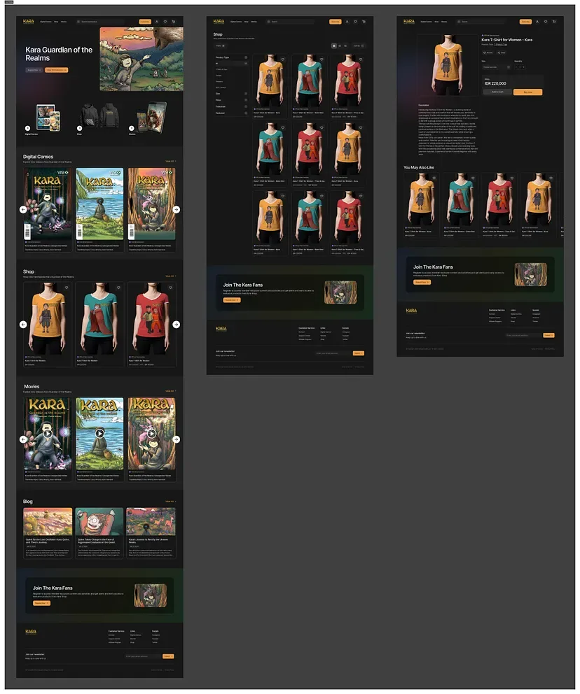
The high-fidelity composition shows the homepage, listing, and detail directions together. It is a compact overview rather than separate full-resolution screens.
Checkout: make cost and fulfillment visible
The proposed purchase path has cart review, address entry, delivery and payment selection, and confirmation. The cart shows the selected item, quantity and subtotal. The next screen captures an address without taking the buyer into a separate account journey. Delivery and payment choices appear before the final confirmation state. The design keeps an Order Summary visible during the transactional steps so the buyer can check what is being purchased as the task changes.
This is particularly important in an Indonesian checkout, where delivery carrier choice, address detail and payment method can influence confidence. The design shows a courier, bank transfer, a digital wallet, and a card option. A working service would need accurate carrier rates, supported payment integrations, and bank-transfer reconciliation. A full local address model would also need fields such as kecamatan and kelurahan when applicable. A clean form cannot compensate for a delivery system that rejects a real address.
The confirmation page uses a clear success state and then suggests Kara digital comics. Its first job is to confirm the order and set expectations. The content suggestion is secondary and should lead somewhere useful. If the proposed comic route is missing, gated unexpectedly, or unavailable, the cross-sell would weaken the trust the checkout just earned.
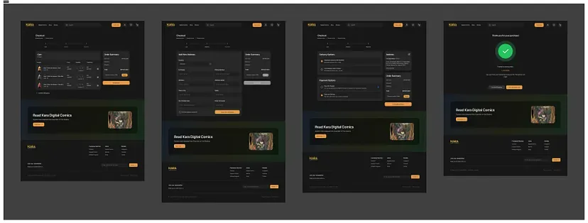
The checkout screens cover cart review, address, delivery and payment, and order confirmation.
🧪 What the Evaluation Supports
Directional feedback from real participants
I tested the design with real participants. The documented evaluation records three response themes. Participants liked the look and feel, describing it as attractive, modern and fun. They appreciated the range of products shown. They also found the payment and shipping direction convenient.
That feedback helped me identify what to preserve in a next iteration: a strong visual world, visible product breadth, and a checkout that explains practical choices. I would then test whether people understand the three categories, choose the right variant, and identify the correct total before committing.
The next review would also look for the moment visual appeal stops helping and product comprehension has to take over. That is where category language, product detail, and total-cost visibility become more consequential than the artwork.
What the design produced
The finished output connected story-led entry, clear category routes, product listing and detail, cart and checkout, and a post-purchase content invitation. It expresses one path from IP awareness to a merchandise decision, with each step supporting the next.
The high-fidelity screens and flow make the decision sequence visible enough to evaluate page by page. They also show where the service behind the interface would need clearer rules for inventory, delivery, payment, and content access.
🚀 Further Enhancements and Product Considerations
Sequence delivery around the smallest truthful journey
If this concept moved toward production, I would begin with an inventory and content audit, not with another visual effect. A minimum useful release would need correct product descriptions and variants, visible availability, a working cart, address validation, delivery quotes, payment status, and order confirmation. The homepage would still need enough Kara story and category context to explain why this is an IP storefront. I would defer richer fandom mechanics until the basic purchase path and content links worked.
The second layer could add a deliberate relationship path: newsletter consent, clear expectations for updates, reliable comic access, and a post-purchase message that connects an item to its story. Later ideas in the journey map—character-based browsing, bundles, a built-in reader, limited-edition drops, saved addresses, referrals and fan tiers—should be tested against actual demand and operational cost. They are opportunities, not completed features or an approved Visi8 roadmap.
This sequence also exposes a commercial trade-off. A large set of engagement features can increase development and content-maintenance work before the team knows whether fans can buy a shirt successfully. A bare product grid may complete a transaction but fail to convey the IP. The first release should contain enough story to orient a new visitor and enough commerce reliability to respect an existing fan's intent.
Specify the states the desktop screens cannot show
A production build would need mobile behavior for filters, carousels, product options, and checkout. The current HiFi is desktop-first. On a smaller screen, a left rail becomes a drawer or sheet; the active filters and result count must remain understandable when it closes. Long editorial content must not bury Shop. Product imagery must load quickly enough to support discovery on everyday mobile networks.
Checkout needs more states than the four happy-path screens. What happens when a size goes out of stock after the cart is filled? When a courier does not serve an address? When a bank transfer is pending, fails, or is paid twice? When a buyer wants to edit an address after seeing the shipping fee? The concept's confirmation screen cannot answer those questions. They require policy, service behavior, and support ownership, not just new mockups.
Content rights and merchandising operations also matter. Comic art, animation previews and character imagery need clear licensing and publishing ownership. The catalog needs clean links among issue, character, franchise, product and inventory. “You May Also Like” is only useful if those relationships are maintained. A limited-edition label requires truthful stock and expiry rules; artificial scarcity would be a trust cost, not a growth tactic.
Define validation before claiming improvement
I would test two tasks with both people unfamiliar with Kara and existing fans. The first asks someone to explain what Kara offers after landing, then find a comic and a merchandise item. The second asks a motivated buyer to select a specific size and color, review the full cost, choose delivery and payment, and explain what confirmation means. I would observe where people hesitate and what they believe will happen next. This would separate visual preference from comprehension and task success.
A pilot's primary purchase measure could be the share of eligible product-detail sessions that reach a confirmed order, compared with the existing route under equivalent traffic conditions. The denominator should include all eligible detail sessions, including people who never add to cart; restricting it to checkout starters would hide discovery and product-fit problems. For a new storefront without an equivalent route, I would report the baseline as new rather than inventing a before-and-after lift. Step-level completion, payment failures, out-of-stock attempts, address errors and support contacts would be guardrails.
For world-building, I would ask whether new visitors can identify Digital Comics, Shop and Movies and understand where each link leads. Category click-through and scroll depth can describe behavior, but cannot alone establish that the story increased affection or sales. For the post-purchase comic invitation, I would first verify that the link resolves to relevant content; only then consider click-through and repeat engagement.
📝 Reflection and Takeaways
The central lesson was that a character-led storefront has two kinds of clarity to earn. The brand must feel like a world worth exploring, and the transaction must feel ordinary enough to trust. The final screens connected those needs by giving unfamiliar visitors content and returning fans direct product routes, then carrying the choice through a straightforward checkout concept.
The work also showed the limit of interface design. A compelling hero cannot repair wrong inventory, a visible Order Summary cannot reconcile a failed payment, and a fan invitation cannot create a community without an ongoing content plan. If I developed the concept further, I would test understanding and purchase tasks before adding more loyalty mechanics.
📌 Disclaimer: This was an independent educational design project, not a commissioned Visi8 Studio engagement or a released Kara website. Rafi and the CJM's thoughts and emotions are illustrative. Real participant feedback is limited to the three documented themes; the available record does not establish a participant count, task-success statistic, conversion lift, or commercial impact. Prices, payment choices, and order confirmation are design examples. Artwork, IP, and brand elements belong to their respective owners, and the observed website may have changed since the study.
💬 Let’s Connect: Have feedback or thoughts on this case study? I'd love to hear from you. Feel free to leave a comment below or explore more of my product and experience work at cahyadiaditya.site. For a discussion, reach me via Telegram or connect with me on LinkedIn. Thank you for reading.