

An end-to-end product case study on course discovery, format clarity, and the path back to learning.
Choosing to upskill sounds simple until a learner has to commit time and money. A working professional may know the skill they want to build but still need to decide which course fits their schedule, whether the format is live or flexible, what the price includes, and how to continue after the first session. A catalog can offer many choices while leaving those decisions to the learner.
I explored that problem through Cakap Upskill, an Indonesian learning product with several course formats. The work connected three questions: how someone discovers a relevant course, how they distinguish among learning formats, and what helps them return after enrollment. The output was a set of high-fidelity mobile screens, problem and solution sketches, a customer journey map, and a user flow.
This case study follows the work from its inputs through its design decisions, then explains how I would evaluate the resulting experience in a learning service.
🧭 Project Context and Scope
The decision behind the catalog
Cakap Upskill brings several learning formats into one product experience.
Cakap Upskill presented learning opportunities in different forms, including webinars, Crash Course, Live Class, Recorded Class, and courses associated with Prakerja. Those labels are useful only when learners understand the commitment behind each one. A short intensive program, a scheduled class, and a recording solve different time and learning needs. Price, instructor, date, and eligibility can matter just as much as topic.
My design question was: how might the mobile experience help a working learner move from a career interest to a course they can understand, choose, and continue? I organized the concept around three connected jobs. The learner needs to find relevant options, judge the difference between them, and maintain momentum once a learning commitment begins.
My Product Designer work covered problem framing, review of the existing interface, synthesis of the documented challenges, sketches, journey and flow design, and high-fidelity mobile screens.
The learner lens
To make the decision concrete, I used Rizky, a persona representing a Jakarta-based marketing professional interested in digital marketing and data skills. He works around a regular office schedule and has to choose between learning ambitions and limited time. The persona also introduces budget and possible Prakerja eligibility as decision factors.
Rizky’s task is more specific than browsing courses. He wants to know whether a program advances a relevant skill, fits the hours available, provides the interaction he wants, and makes financial sense. A recommendation that matches “data” but ignores class timing is only partly relevant. A card that displays a discount but hides the format can create false confidence. Those observations shaped which information I chose to surface earlier in the journey.
The design scope starts at account entry and interest selection, moves through course browsing and comparison, and sketches the return path after enrollment. It does not design a complete curriculum, verify learning outcomes, establish Prakerja eligibility rules, or specify the operational systems behind course inventory, payments, reminders, and certificates.
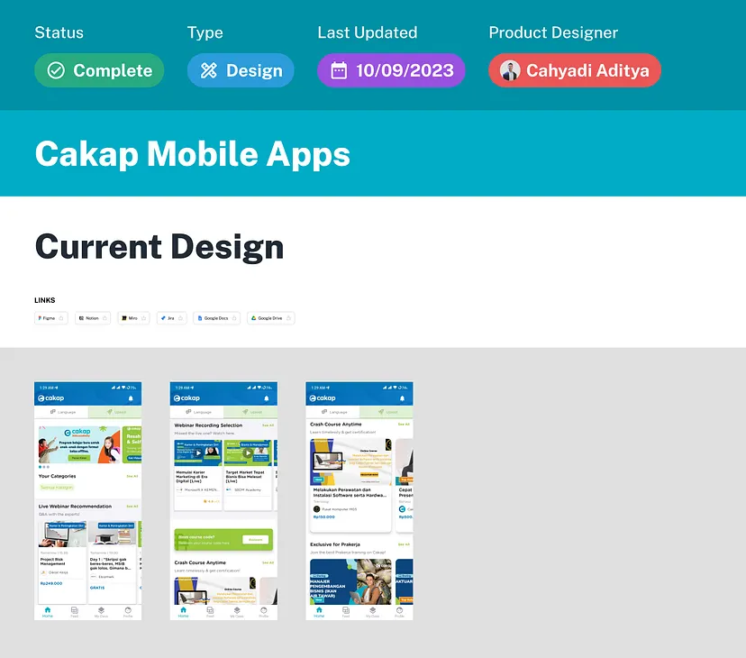
The earlier mobile experience supplied the visual baseline for this study. The capture is historical and does not represent the current production app.
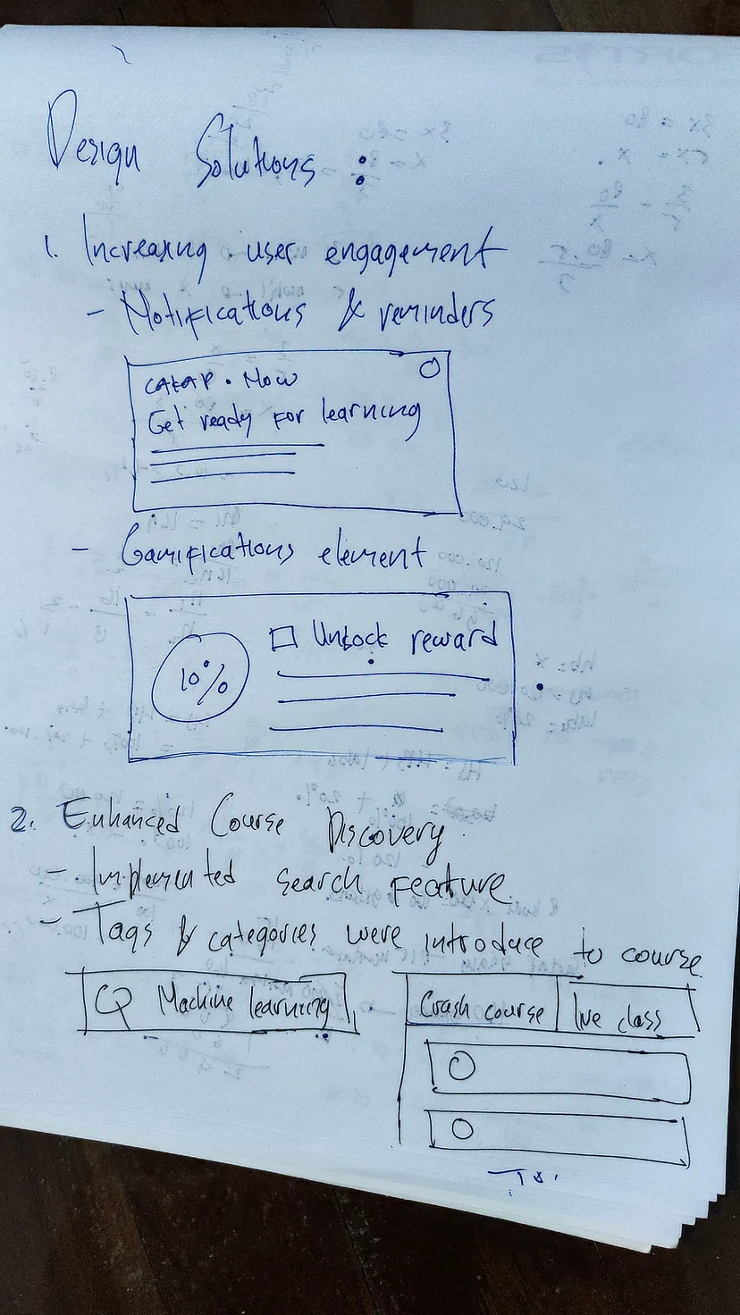
Early sketches connect reminders and progress to the return journey, and search with tags to discovery.
🧠 Three Problems, One Learning Decision
Participation is a journey question
The problem framing identified a need for more active students and stronger webinar attendance. A person who enrolls but does not return might have forgotten, lost interest, faced a schedule conflict, or found the course unsuitable. The materials do not isolate those causes. I therefore used reminders and progress as possible supports for continuation, not as a proven cure for inactivity.
Breadth can make discovery harder
A learner may know a subject area without knowing the exact course title. A page that mixes multiple programs makes them interpret the catalog before they can compare fit. Search can help when the learner has a precise term; categories and interest signals can help when they do not. The useful design question was how both paths could meet at an understandable set of courses.
Format clarity is part of relevance
A learner looking for flexibility may reject a live class even if the topic is right. Another learner may value an instructor-led session enough to accept a fixed schedule. If the list card hides the distinction until the detail page, the learner repeatedly opens unsuitable options. Format, timing, and price therefore belong near the point of comparison.
These themes relate to one another. Clearer format labels make search results easier to judge. Better comparison helps the learner commit to a course that fits. A return prompt has more value when the original selection was a good one. I treated this relationship as a design hypothesis, not a measured funnel model.
🗺️ Journey, Sketches, and Interaction Structure
Mapping the moments that matter
The customer journey map follows a representative path through sign-up, discovery, course evaluation, a learning session, and return or completion. It records what the learner would do, which touchpoints would support them, and where a decision might fail. Rizky’s thoughts and emotional curve helped me explore the experience across those transitions.
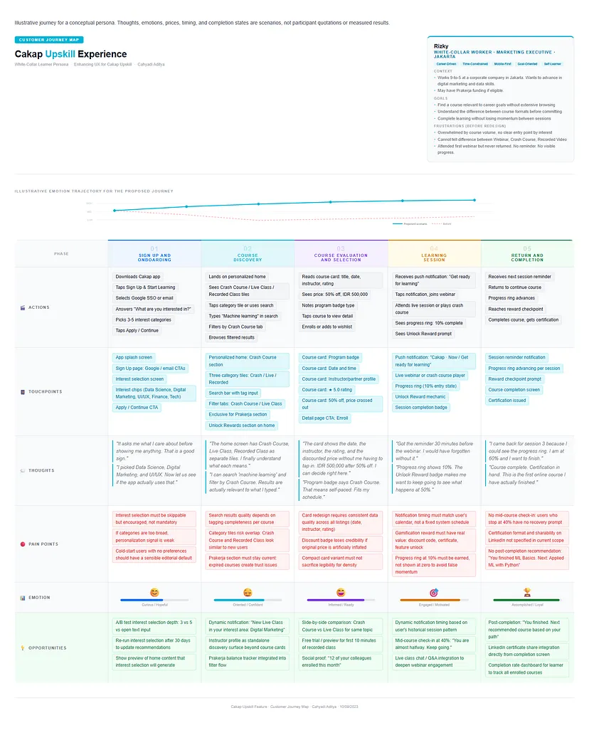
The customer journey map makes the journey and its decision points inspectable from first interest to learning continuation.
The map helped separate needs that a single homepage cannot solve. Onboarding can capture an initial interest; it cannot guarantee the recommendation is good. A course card can make a decision easier to assess; it cannot validate the instructor or the quality of the content. A reminder can bring an enrolled learner back to the next session; it cannot make the course worth completing. The design needed to connect these moments without treating a screen as a substitute for service quality.
The second sketch explored how that connection might become visible. It placed course formats at the top level and introduced a more structured course card beneath them. This was a useful change in perspective: format is not an obscure metadata field when it determines whether a working learner can attend at all.
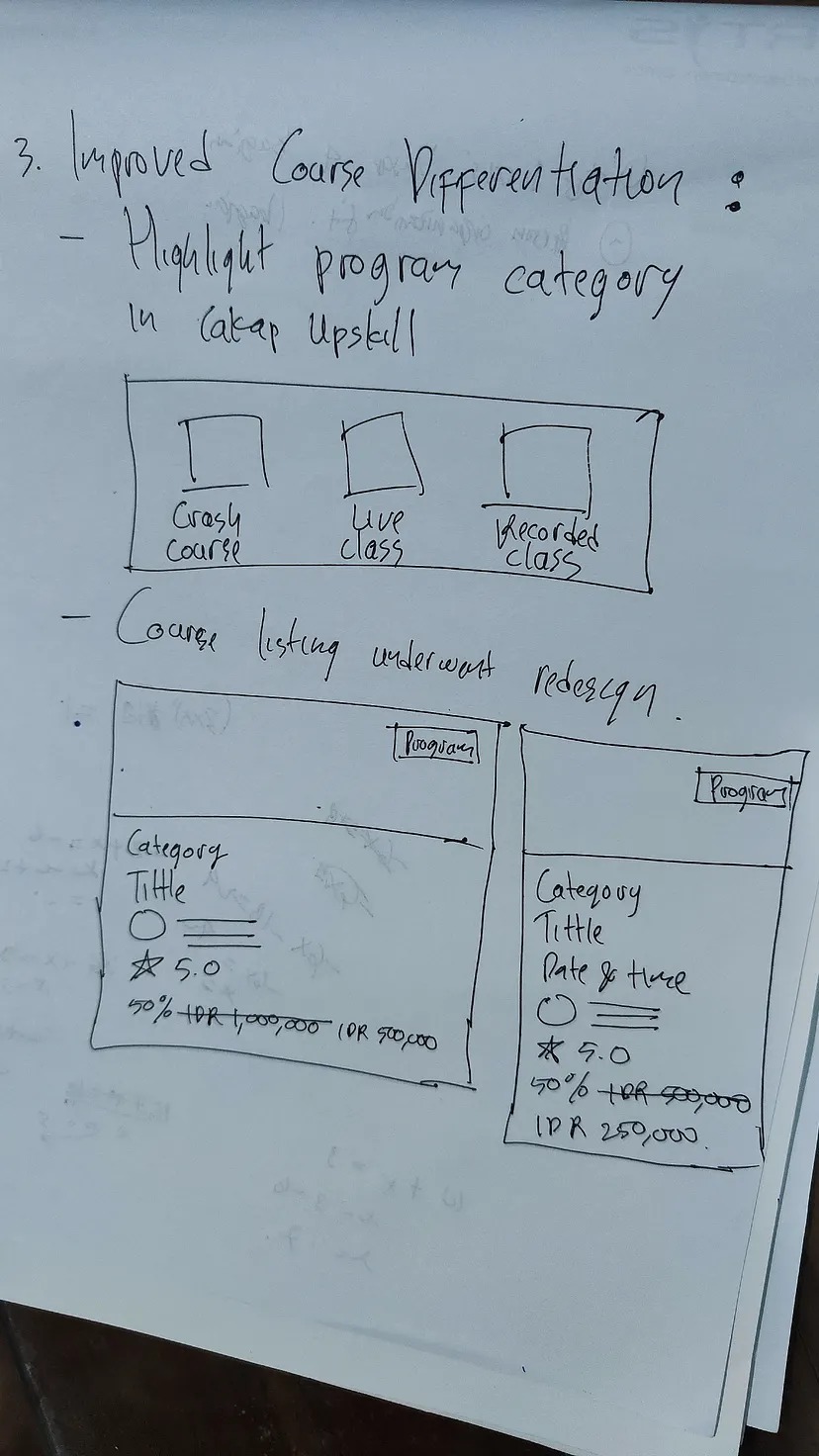
The sketch tests the relationship between a navigable course format and the information needed to judge a specific course.
Turning the journey into a flow
The user flow connects account entry and interest selection to a personalized home, browsing or search, course detail, and an enrollment decision. It then sketches reminders, visible progress, and a possible completion state. There are two discovery branches because learners arrive with different levels of intent: some want to explore a format, while others know a topic and need to search.
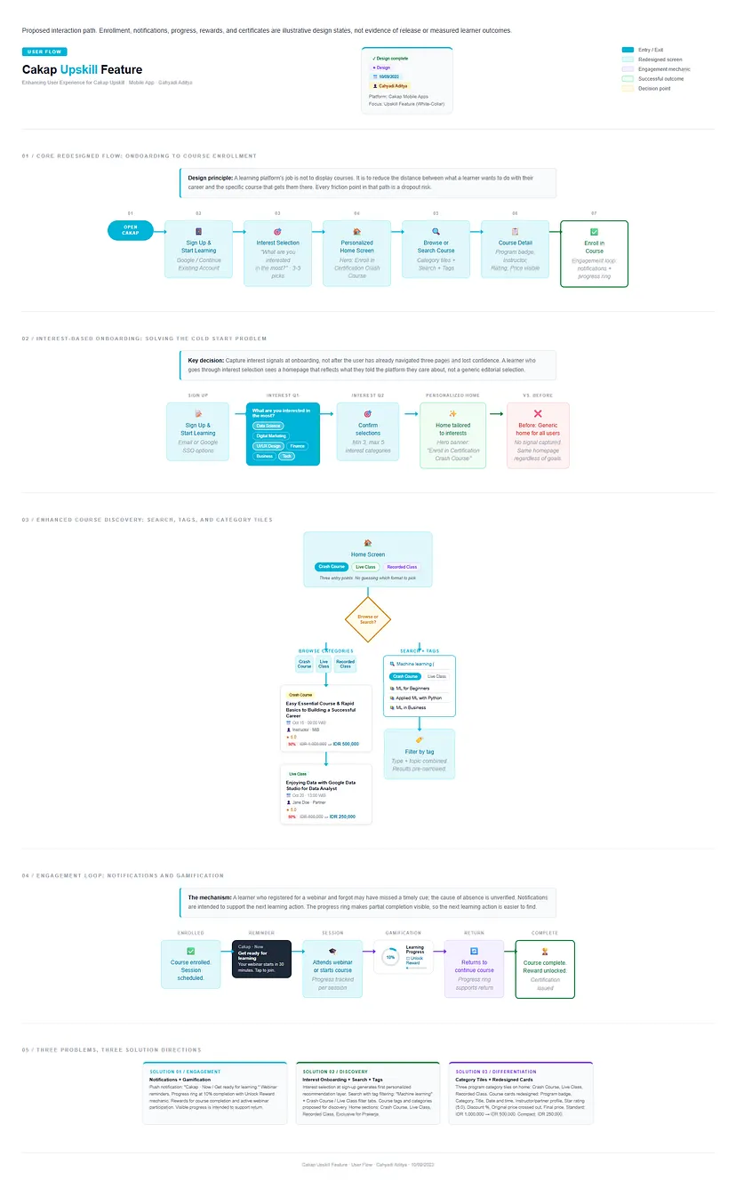
The user flow connects discovery to enrollment, reminders, progress, and a possible completion state.
The flow exposed a dependency. If interest selection does not map to reliable course tags, the first homepage could feel arbitrary. If the search and browse branches use different definitions of a Crash Course or Live Class, a learner may see contradictory results. If an enrollment does not create a dependable schedule record, even a well-written reminder will arrive at the wrong time. Those dependencies informed the order in which I would validate the concept.
📱 Interface Decisions and High-Fidelity Output
The high-fidelity output keeps the original screen direction: account entry, interest selection, a home experience organized around Upskill, course content, and a notification state. The full overview brings the entry, interest selection, course discovery, and return experience together. Search, card comparison, progress, and reward details are also described in the sketches and flow, so their implementation depth should be read from those artifacts rather than assumed from one overview image.
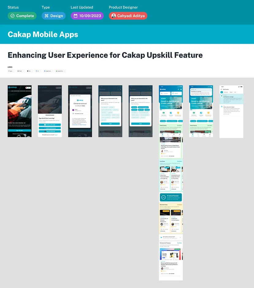
The high-fidelity overview brings the entry, interest selection, course discovery, and return experience together.
Capture an interest before recommending a course
The onboarding concept asks what the learner is most interested in. Topic choices such as data science, digital marketing, UI/UX, finance, business, and technology create a first signal that the home experience can use. A learner who chooses digital marketing should see a course or category relationship they can recognize. If the next screen appears unchanged, the question becomes friction with no visible benefit.
There is a cost to asking early. Someone exploring casually may not know their interest yet. Mandatory selection can delay access, and an imprecise category can lock a user into poor recommendations. In a working version, I would make the step easy to skip or revise, provide a sensible general home for unknown interests, and test whether selected interests actually improve the first decision.
Give learning formats an understandable place
The home concept makes Upskill more visible and gives major formats distinct entry points. Crash Course, Live Class, Recorded Class, and a Prakerja-related path should tell the learner what kind of commitment lies ahead. A topic recommendation can sit alongside these format choices, but it should not erase them: “relevant to me” and “possible for my schedule” are different tests.
Separating formats helps a learner orient before scrolling through individual courses. It also creates a responsibility to define each label consistently. “Crash Course” needs a stable meaning for duration, pacing, and live participation across programs. Without a content taxonomy agreed with catalog owners, visually distinct tiles could make the differences look clearer than they really are.
Support browse and topic-led search
The user flow offers a second path for someone who already knows the skill they want to study. A query such as “machine learning” can be narrowed by course type and meaningful tags. The purpose is to combine topic intent with delivery fit. A search result needs consistent topic tags, format labels, and empty-result behavior.
Make course cards useful for comparison
The card sketch and flow organize a course around the information a learner needs early: program type, subject, title, date and time when relevant, instructor or partner, rating, original and discounted prices, and the final payable amount. These are interface examples, not current offers or verified transaction prices.
The reasoning is about sequencing information. A learner should be able to reject an unsuitable class without opening every detail page. Format, schedule, topic, and final price deserve strong hierarchy. A rating is useful only when its source and review count are credible, and a discount badge should not dominate a card when the learner still cannot tell whether the course is live or recorded.
Tie reminders to an existing commitment
The notification state responds to a learner who has registered for a scheduled session. A useful reminder says what is happening and when to return, such as a webinar about to start. A production design would need enrollment state, accurate event time zones, consent, quiet hours, a deep link to the right session, and handling for canceled or rescheduled classes.
Show progress without turning rewards into the goal
The sketches and flow use a progress ring and an “Unlock Reward” prompt to show that a learner has started and can continue. Progress needs a definition: watching a video, completing an exercise, attending a live session, and finishing a course are different events. If the ring conflates them, it may reward superficial activity. I would treat the mechanic as a later validation layer, not a substitute for course quality or accurate recommendations.
🧪 Design Outcome and Evaluation
The concrete outcome of the study is a connected interface direction: initial interest capture, clearer format entry points, browse and search routes, richer course information, and a continuation loop. The sketches, customer journey map, user flow, and high-fidelity screens explain how the design connects a learner’s interest, course choice, and return to study.
The next evaluation would test whether learners understand format differences, can choose a course that fits their schedule, and can find their way back to the next learning activity. A useful result would show both comprehension of the offer and progress through the journey, rather than a favorable reaction to one screen.
The design’s strongest contribution is its causal structure: it connects an expressed goal to a relevant set of courses, makes the difference among those courses easier to evaluate, and gives an enrolled learner a path back. Whether that structure changes behavior remains an open product question.
🚀 Further Enhancements and Product Considerations
If this concept were taken toward delivery, I would begin with the course taxonomy and listing information. The team would need definitions for Crash Course, Live Class, Recorded Class, webinars, and Prakerja-related inventory, then reliable fields for schedule, instructor, price, eligibility, and topic. A clearer card cannot be truthful if those attributes are missing or inconsistent.
Next I would test the home format hierarchy and course-card comprehension together. Topic search and format filters would follow with quality checks for queries, tagging coverage, zero results, and the relationship between filter labels and actual courses. Interest selection would add value when the catalog can respond to it. Notifications and progress would come after enrollment and learning events are trustworthy.
The concept would also need answers for a learner who skips interests, chooses conflicting topics, gets no search results, switches format, or sees a class that later sells out. Schedule changes matter after enrollment: a canceled webinar should suppress its reminder, and a rescheduled class should update the event and message. These states affect trust more directly than adding another reward badge.
For evaluation, I would separate three questions: can learners identify the right kind of course, does the interface help qualified course progression, and does continuation improve after enrollment? These are measurement proposals, not results of this study. The learner’s explanation of why a course fits would matter as much as the speed of reaching a card.
📝 Reflection and Takeaways
The most useful lesson was that course discovery, course comparison, and return behavior are one decision sequence. Helping a learner arrive at a relevant course is only the first step. The format must be understandable, the commitment must fit their life, and the next session must be easy to find.
It also exposed the limits of interface work. A clear format tile depends on a clear format definition. A personalized home depends on accurate catalog tags. A progress ring depends on meaningful learning events. Without those foundations, the interface may look more coherent while the learner still makes a poor choice.
📌 Disclaimer: This case study presents my digital product process and perspective through an independent concept created for educational purposes. It was not an official engagement or a released product change. Illustrative elements, research limitations, and the absence of verified product or business impact are stated based on the available project evidence. Third-party brand names and imagery remain the property of their respective owners and are shown for portfolio context. All views expressed are my own.
💬 Let’s Connect: Have feedback or thoughts on this case study? I’d love to hear from you. Feel free to leave a comment below or explore more of my product and experience work at cahyadiaditya.site. For a discussion, reach me via Telegram or connect with me on LinkedIn. Thank you for reading.