

An end-to-end product case study on preserving room intent from inspiration and professional guidance through furniture selection and purchase.
A room plan and a furniture order answer different questions. The plan explains how a space could work. The order specifies what someone can buy, what it costs, and when it will arrive. Kisah Ruang brought professional interior design and a furniture marketplace into one website, making the connection between those decisions central to the experience.
In 2021, I worked as the end-to-end User Experience Designer, collaborating with Product Management, Engineering, and Business stakeholders. My scope covered research, experience strategy, information architecture, wireframes, a component system, high-fidelity design, prototyping, usability testing, and developer handoff. The website was released. The central design decision was to connect the designer's shopping list to the marketplace so users could act on a room plan without rebuilding their choices elsewhere.
🧭 Project Context and Product Problem
The gap between an inspiring room and a purchasable one
The project began with a familiar furnishing problem. People could collect references on Pinterest or Instagram, look for a designer, and compare furniture across websites. Moving between those activities still required them to carry the room context themselves: dimensions, preferred style, budget, materials, and the relationship among individual pieces.
Someone hiring a designer might receive a plan and then have to locate the specified items across stores. Someone shopping independently might find an attractive sofa but struggle to judge whether it would fit the room or work with other pieces. Kisah Ruang's opportunity was to connect expert guidance with product discovery while allowing either activity to remain a useful starting point.
This shaped the design question: how could the website help a user turn room inspiration into choices they understood and could act on? The answer needed to cover more than a shared header. A designer recommendation would lose value if its product links led to unavailable variants, a total outside the user's budget, or delivery dates incompatible with the room plan.
Two valid entry routes
I treated the service and marketplace as distinct user intents within the same experience. A visitor who knew which furniture category they needed should be able to shop directly. A visitor who needed help defining a room should be able to understand the service, evaluate designers, and choose a package. Visitors could also arrive through inspiration content before deciding which route suited them.
The shared homepage therefore had to explain the relationship among these routes without demanding a commitment too early. The service pages needed to make the process and deliverables understandable. The shop needed to support careful comparison. The connection between them would become most valuable when the design work produced a shopping list.
My responsibility was to shape that user experience and its design artifacts. Product, engineering, and business collaboration provided the surrounding delivery context; this case study focuses on the decisions and outputs within my UX scope.
🔎 Research and Experience Strategy
Understanding how people researched and bought furniture
The discovery work included interviews with urban residents aged 28–50 who had recently purchased or planned to furnish a home. Participants described using online platforms to research and compare, while often preferring an offline visit to assess the product physically. They drew inspiration from social platforms and considered price, aesthetics, and functionality when making a decision.
The tension was useful for design. Online discovery offered breadth and convenience, yet the decision remained physical: whether a finish would look right, a material would feel acceptable, and an item would fit. More products would not resolve those questions by itself. The interface needed to make relevant evidence easier to inspect and help users translate visual preferences into specific choices.
The quantitative discovery record reported five signals: 87% wanted free shipping and returns, 73% valued customer reviews, 65% wanted 360-degree product views, 60% most often shopped for living-room items, and 42% used furniture sites for research as well as purchase. I treated these as signals from the study rather than population estimates; the retained record does not include the respondent count or survey instrument.
Those signals pointed to different design responses. Shipping and returns belonged in the purchase decision. Reviews could help people assess an item in a real home. Living-room browsing deserved a clear category path. Research-oriented visitors needed useful content even when they were not ready to transact. Interest in 360-degree views identified an uncertainty to solve, while leaving open how much technology the first delivery should require.
Comparing service and retail patterns
The benchmark examined Dekoruma, Fabelio, IKEA, Wayfair, and West Elm across interior design services, imagery, product descriptions, quality signals, reviews, shipping and returns, promotions, immersive views, fabric previews, and assembly information. It helped separate the information people needed from the particular interface pattern used to present it.
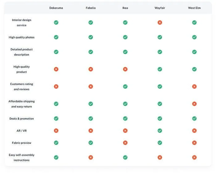
The project benchmark is a historical comparison used for design exploration; the ratings are not a current assessment of these businesses.
I used the matrix to identify combinations worth exploring rather than to claim that Kisah Ruang had no competitors. Its most useful question was whether someone could discover a style, access professional help, and evaluate furniture with enough information to proceed. That focus also avoided turning the benchmark into a feature-copying exercise. A capability such as AR could be relevant to uncertainty about size, but its presence elsewhere did not establish that it should lead our delivery priorities.
Turning observations into a usable brief
The affinity map grouped observations around why people visited furniture marketplaces, what persuaded them to shop online, how they chose products, which rooms they furnished, and what they expected from a design service. Grouping the inputs made it possible to connect a behavior to a specific design requirement.
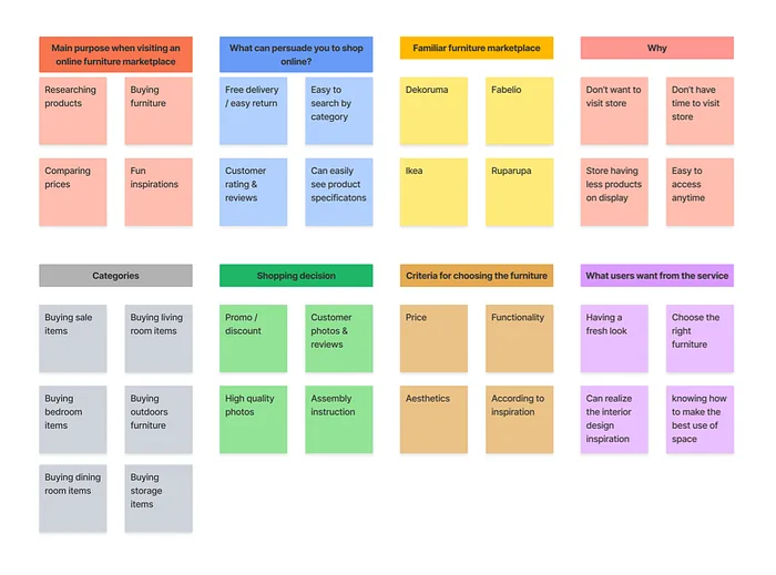
The synthesis brings research behavior, product evaluation, room needs, and design-service expectations into the same view.
For example, research and price comparison suggested that browsing needed to remain useful without immediate checkout. The wish for precise specifications supported dimensions and material information. A desire for a coherent room suggested a connection between design advice and a set of products. These relationships mattered more than treating every sticky note as a separate feature request.
I synthesized the patterns into Lydia, a business development professional in Jakarta who had bought a one-bedroom apartment and wanted to furnish it around a busy schedule. Her profile combined strong visual preferences with practical uncertainty: how to find quality furniture at an acceptable price, judge photos and measurements, manage returns, and avoid repeated store visits.
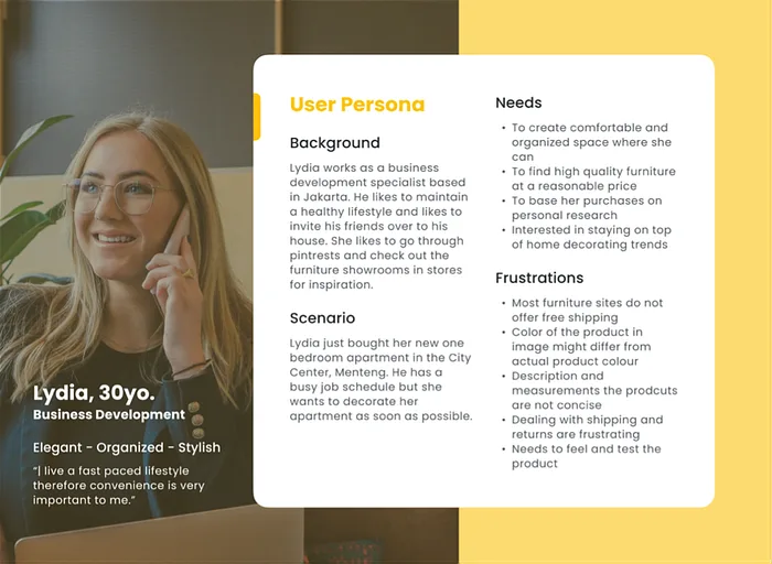
Lydia focuses the brief on a person coordinating a room, a budget, and limited time.
Lydia's scenario helped me evaluate the product as a sequence of decisions. Could she understand the service before booking? Judge a designer's visual fit before opening many profiles? Carry a room plan into the shop? Compare lead times before placing an order? The persona kept the design focused on the coordination work around a room rather than only the appearance of an individual product page.
🗺️ Prioritization and Journey Architecture
Distinguishing information from operational complexity
The impact-effort matrix placed designer profiles, package information, product photography, variants, specifications, filtering, and account entry toward the foundation of the experience. These surfaces helped users understand the offer and evaluate a choice. Chat, payments, order management, project setup, reviews, and tracking were grouped as more demanding capabilities because they linked the interface to ongoing service or transaction behavior.
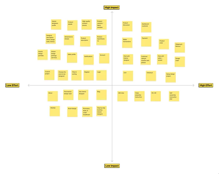
The matrix makes relative priorities visible across information, service, commerce, and advanced visualization features.
I read this as a distinction between design importance and delivery dependency. Checkout was still necessary for a purchasable journey even though it required more effort. Product specifications could be easier to present, but they remained useful only if the catalog data was dependable. The matrix organized those trade-offs; it was not a costed engineering estimate or a release calendar.
The lower-priority area included 360-degree views, assembly video, AR/VR, and downloadable assembly instructions. This kept attention on the underlying uncertainty before committing to an expensive format. Accurate dimensions, consistent photography, and clear material choices could support evaluation while more immersive capabilities remained opportunities for later validation.
Organizing one website around the two routes
The information architecture separated Service, Shop, and Blog while keeping search, account, and cart accessible. Under Service, users could find the explanation, packages, designer directory, and custom-project options. Under Shop, discovery could begin with a product category, a room, or a brand. Account areas held the longer-running work of transactions, design questions, and order status.
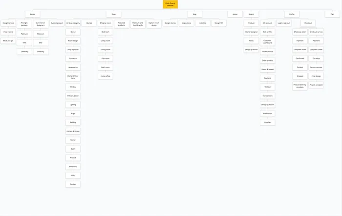
The architecture gives service discovery and retail browsing their own structure while retaining shared account and transaction areas.
This separation supported clarity without isolating the businesses. A room category could lead to furniture immediately; a designer page could explain a package without competing with a catalog grid. Shared navigation and account patterns would help a user move between them with less reorientation.
The original transaction flow made the commitment sequence explicit. The design-service path included account entry, package and designer choices, room selection, checkout, project details, concepts, final design, and a shopping list. The purchase path moved through browsing, product detail, cart, checkout, payment, and order status.
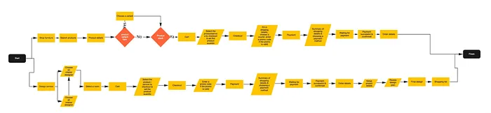
The early flow places purchase and project-order steps in sequence before the more detailed journey view.
The distinction between discovery and commitment was important. A visitor could explore style and designer options before buying a package, while the detailed project intake belonged to the service order. Keeping those moments clear helped explain what the user could inspect freely and what happened after a paid commitment.
Connecting the shopping list to marketplace evaluation
The complete user flow brings the homepage routes together. On the service side, an optional Style Quiz offers a starting point, followed by room and package information, designer matching, online collaboration, and deliverables. On the retail side, room-led browsing leads to a listing, product evaluation, and checkout. The designer's shopping list links the two.
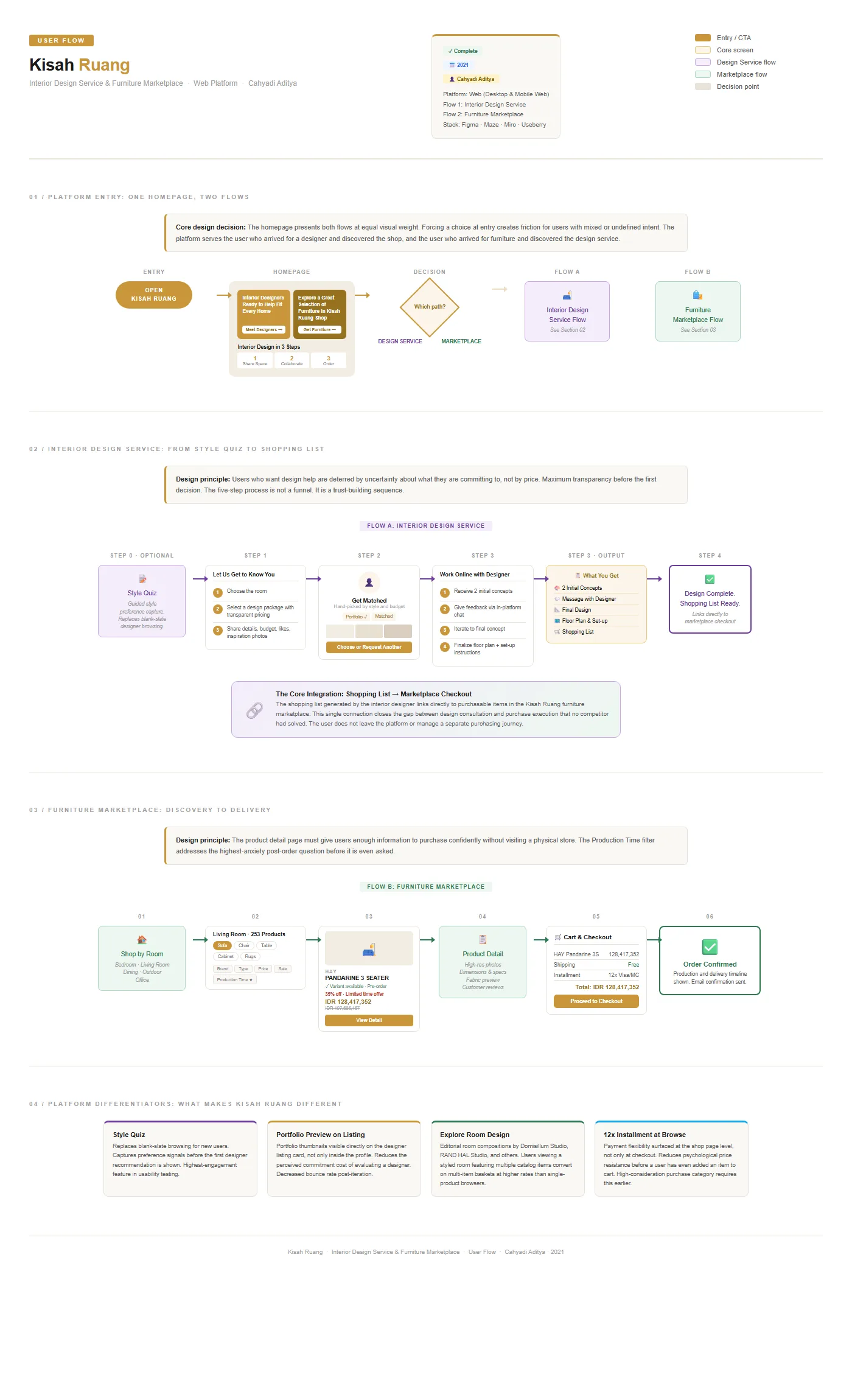
The user flow illustrates the intended paths and their connection. Completion nodes, sample commercial values, and performance annotations describe scenarios or hypotheses rather than evidence that each illustrated capability produced an uplift.
The design intent was to preserve the reason for a recommendation. When someone followed a sofa from the shopping list, they should understand which variant was selected, why it suited the room, and how it contributed to the budget. A generic product link could carry them to the shop while losing precisely the context they had paid the designer to establish.
The customer journey map examines that same sequence from Lydia's perspective. Discovery and matching need orientation. Collaboration needs visible expectations and feedback. Shopping needs product confidence. Checkout and the wait for delivery need a credible account of cost and timing.
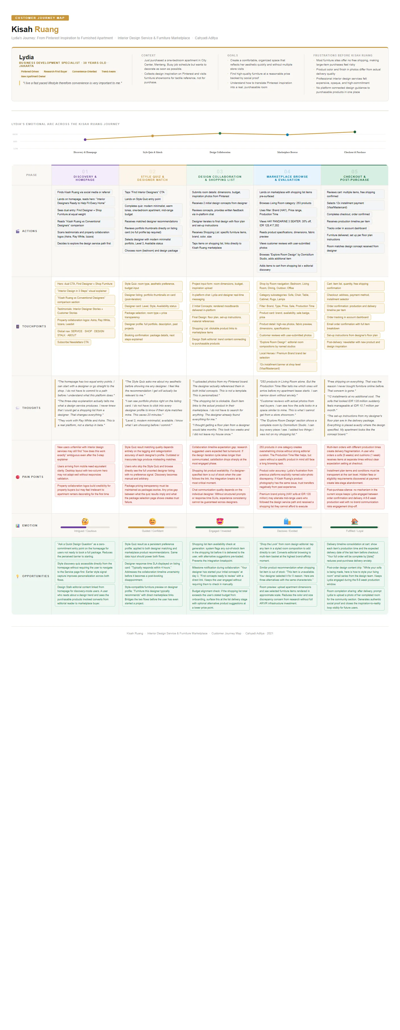
The CJM models an intended journey; its quoted thoughts, emotional curve, purchase examples, and opportunity effects are illustrative.
The map was particularly useful at the handoffs. A designer's delayed response could undermine an otherwise clear booking flow. An unavailable product could break the shopping list. Different production times could make one cart feel like several uncertain orders. These were questions for the product and service model, and I carried them into the further-enhancement priorities rather than treating a completed screen as their resolution.
🎨 Wireframes and Design System
Establishing the page relationships before visual detail
The wireframes explored the homepage, service explanation, shop landing, and cart. The homepage placed two entry routes above the explanation of Kisah Ruang. The service page reserved space for how the engagement worked. The shop organized discovery around rooms and brands. The cart represented the point where selected products and a service order needed clear transaction information.
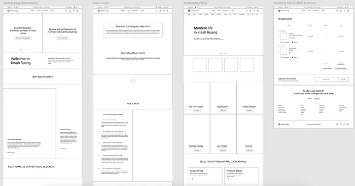
The wireframes establish content priority and page relationships before the final imagery and styling.
The project used clickable wireframes and prototypes to explore the journey. At this stage, I needed to understand whether the page sequence explained the service and supported discovery before investing in visual refinement. The structure also made the two businesses easier to discuss with product and engineering: which content introduced an offer, which action created an order, and which information belonged to an ongoing project.
Reusing patterns across services and commerce
The component library included buttons, forms, input groups, navigation, breadcrumbs, pagination, alerts, badges, and progress treatments. These recurring patterns gave the service and shop a shared interaction language even when their content differed.
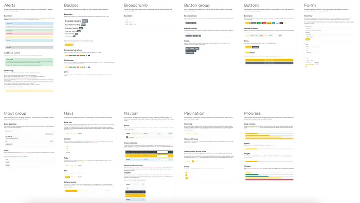
Reusable controls and feedback patterns support consistency across both product areas.
That consistency had a practical role. A form for a room brief and a form for a purchase have different fields, but both need understandable labels, validation, and a clear next action. A product card and a designer card have different evaluation criteria, but both need a readable hierarchy and a recognizable route into detail. Shared components reduced the need to solve those interaction problems separately on every page.
The visual foundation used a warm neutral base and yellow-gold accents, with separate colors for status and feedback. The palette allowed furniture and room photography to carry most of the visual interest. Borders, backgrounds, shadows, and text styles provided structure around that imagery.
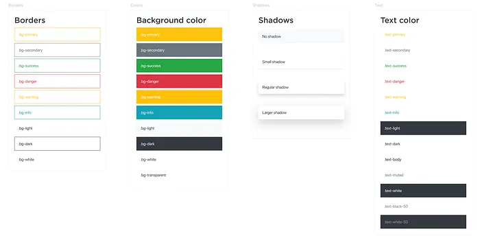
The visual styles define reusable surface and text treatments rather than styling each page independently.
The typography scale distinguished page introductions, section headings, supporting copy, and detailed information. This was especially relevant to long pages where visitors needed to move between inspiration and evaluation without reading every section in order.
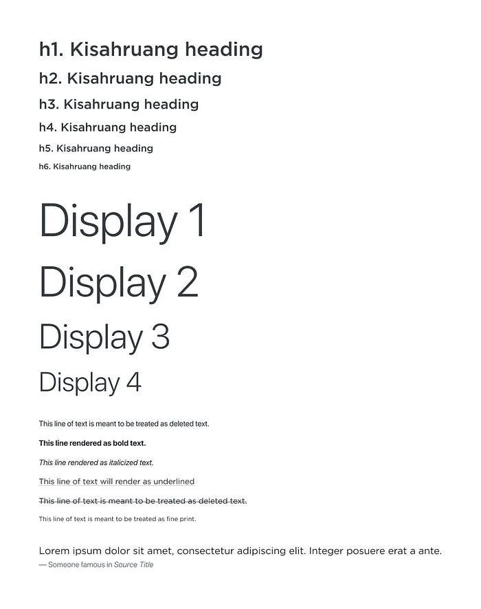
The type scale creates a consistent hierarchy across editorial, service, and shopping content.
The project addressed desktop and mobile web, but the retained HiFi shown here is desktop artwork. The library and responsive intent are useful design outputs; a component sheet alone does not establish accessibility conformance. Keyboard behavior, contrast, focus, and reflow would need to be checked in the implemented experience.
🛋️ High Fidelity Experience and Design Decisions
Homepage with two useful starting points
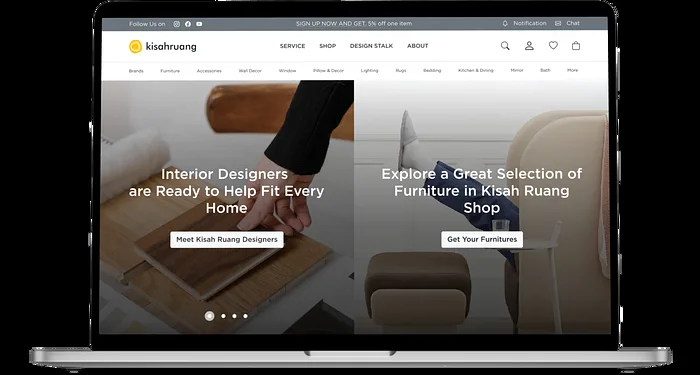
The homepage hero places finding a designer and browsing furniture side by side. That gives visitors an immediate route based on the help they need. It also makes the combined proposition visible before the rest of the page explains it.
The next sections introduce the service and contrast it with a conventional design engagement. Online access and transparent pricing address the perceived difficulty of getting started. A three-step explanation then compresses the overall story into sharing a space, collaborating with a designer, and ordering the selected items. The detailed service page expands those steps later.
Further down, furniture, editorial inspiration, customer stories, and property-collaboration logos show the broader product context. Their placement explains how the two routes belong together, while repeated actions offer a way to proceed after reading. The logos and testimonials in the artwork are interface content; their appearance alone does not establish a partnership or an independently verified endorsement.

The complete homepage progresses from route selection to service explanation, furniture discovery, and supporting content.
The trade-off was page length. Explaining a service alongside a shop required substantial content, but an urgent shopper should not have to read it all. The hero actions and persistent navigation were therefore central to the structure. The long page was an available explanation, while direct routes remained visible for people who already knew their task.
Design service with a visible process and concrete deliverables
The service page starts by answering how a designer can help, then moves into the working relationship. It asks users to choose a room and package and share their needs, budget, and inspiration. Matching connects those preferences to a designer. Collaboration produces two initial concepts, feedback, a final design, a floor plan, setup guidance, and a shopping list. Ordering and enjoying the room complete the service story.
Making the deliverables explicit was important because “interior design service” could imply different levels of commitment. A user could inspect what the package was meant to produce before deciding whether it met their need. The page also explains online collaboration rather than leaving the person to infer how a remote engagement would work.
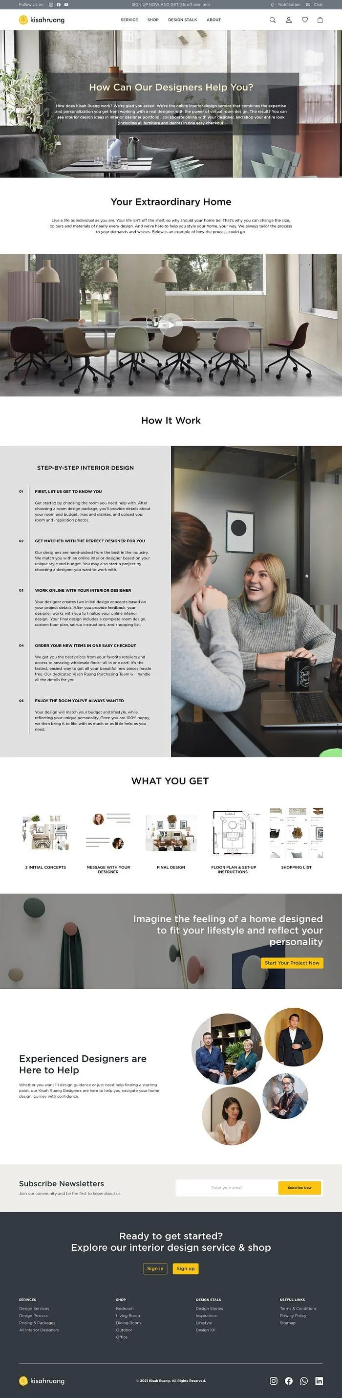
The service page explains the engagement and its deliverables before directing visitors toward a project or designer.
The Style Quiz and portfolio direction supported the earlier evaluation stage. The quiz offered a starting point for someone who could recognize a room they liked but could not name its style. Portfolio access helped someone judge the designer's work. These served different needs: guidance for forming a preference and evidence for evaluating an expert. The shared flow connects both to package selection rather than treating the quiz as an isolated engagement feature.
The shopping list was the service's most consequential deliverable for the wider platform. It created a path into purchasing specific items. To remain useful, that path would need to retain the selected variant, quantity, price context, and room intent. Those dependencies informed how I thought about the service-to-shop connection even where the supplied artwork stops at the page-level experience.
Marketplace landing page with room and brand discovery
The shop homepage gives furniture its own discovery experience. A hero introduces the collection, then room tiles provide recognizable entry points such as Bedroom, Living Room, Dining Room, Outdoor, and Office. This lets a person begin with the space they are furnishing rather than already knowing a product name.
Curated product selections sit alongside local and premium brand groupings. Room compositions add context around individual objects, while Design Stalk content supports visitors who are still exploring an aesthetic. The marketplace can therefore serve a direct buyer and a person assembling preferences over several visits.

The shop landing connects room categories, curated products, brand discovery, room compositions, and editorial content.
This page is distinct from the category listing. Its job is to help the user choose where to browse. A composition can make a combination understandable, but the images alone do not create a complete “Shop the Look” transaction. Connecting every pictured item, showing the room total, and supporting alternatives would be further product work.
Installment messaging appears during browsing, before the user reaches payment. That reflects the role of affordability in furniture evaluation. It also creates a responsibility for clear eligibility, term, and total-cost information wherever a user later commits; the banner by itself cannot answer those questions.
Living Room listing with relevant comparison controls
The Living Room page moves from orientation into selection. It shows category shortcuts and filters for brand, type, price, sale status, and production time. The grid places photography, product identity, price, and visible availability or promotion cues together so visitors can narrow the options before opening details.
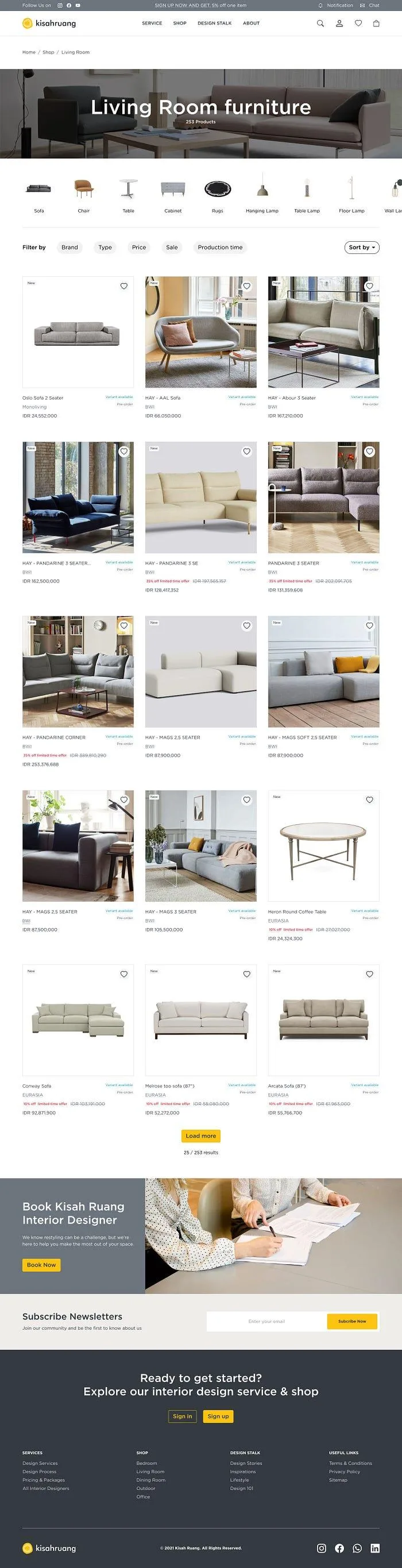
The category page supports narrowing and comparison, then offers a route to professional design help.
Production time was a useful filter because a furniture choice can be unsuitable even when its style and price fit. A person furnishing an apartment may have a move-in date or need several items to arrive in a workable sequence. Putting time in the browsing controls makes it part of selection rather than a surprise after purchase.
The source screen's 253-product count, premium prices, discounts, stock language, and installment messaging are examples within the design. Their product role is to make comparison information visible; they are not a current catalog or offer. At product-detail level, the research and flow called for dimensions, materials, variants, contextual photography, and reviews. The retained visuals show the listing and define that intended detail path without supplying a separate full product-detail HiFi export.
The invitation to book a designer near the bottom connects shopping back to guidance. It offers a next step when narrowing the catalog still leaves the user unsure. That route is useful because service-to-shop integration can work in both directions: a room plan can lead to products, and difficult product decisions can lead to professional help.
Design Stalk for people still developing intent
The editorial page presents article cards with imagery, summaries, search, and sorting. It gives visitors a way to explore room advice and design ideas before choosing a service or product. This aligns with the research signal that some people use furniture websites primarily for learning and comparison.
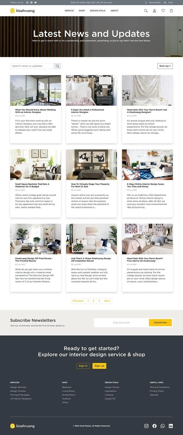
Design Stalk provides a lower-commitment discovery route alongside services and shopping.
The product question is what the reader can do after finding a useful idea. An article about a small bedroom could lead to relevant room categories, a designer, or products that fit the constraints discussed. The listing establishes the editorial entry point; richer contextual links and room-level purchasing remain opportunities to validate.
Across these five page designs, the shared navigation, imagery, typography, and calls to action keep the website recognizable. More importantly, the pages give different decisions a suitable place: understand the offer on the homepage, inspect the service, explore the catalog, narrow a category, or learn through content.
🧪 Evaluation and Reported Outcomes
Feedback across the service and shopping routes
Moderated usability testing with real participants covered both flows. The documented feedback highlighted portfolio access as a trust cue, the Style Quiz as an engaging starting point, and the three-step explanation as a helpful way to understand the service. The recorded iterations included improving call-to-action hierarchy and adding a comparison with conventional interior design.
I used those themes to examine where the interface asked for confidence. A person evaluating a designer needed evidence of visual fit. Someone unsure of their own style needed guidance before a directory. Someone considering a package needed to understand the service before choosing it. The changes addressed those decisions rather than treating visual preference as the only test outcome.
The testing record does not provide a participant count, task script, raw observations, or completion rates. I therefore describe the feedback as directional. In particular, feedback about portfolio access on designer listings is separate from the product-detail bounce metric in the business reporting; the two should not be combined into one measured experiment.
What was delivered and what the business reported
The work produced a website experience spanning services, furniture discovery, editorial content, accounts, and transaction flows, supported by wireframes, prototypes, a component library, and developer handoff. The project was released, and the historical business reporting recorded three changes: site engagement increased by 42%, product-detail bounce decreased by 30%, and furniture conversion increased by 18%.
These results describe movement after launch, while the available record does not establish how much any individual design decision caused. Engagement with the quiz, easier access to a portfolio, catalog quality, acquisition, pricing, and operational changes can influence different parts of that journey. I would not assign all three business results to the homepage or treat the percentage changes as a controlled experiment.
The design contribution is clearest in the connected experience and reusable system delivered. The reported results give business context around the release. The most valuable product learning was where the combined service could create additional usefulness: preserving the room plan as a user moved toward the items needed to realize it.
🚀 Further Enhancements and Product Considerations
Protect the designer recommendation when it becomes a product choice
If I extended the product, I would first strengthen the shopping-list handoff. Each recommendation should preserve its room, selected variant, quantity, quoted price, and reason for inclusion. Before the list reaches the user, the service should check availability and compare the total against the stated budget. An unavailable item should have a reviewed alternative rather than send the person back into an unrestricted search.
I would validate this with a narrow set of rooms, packages, and catalog partners before expanding matching complexity. A smaller dependable set would make it easier to examine whether recommendations stayed purchasable and whether users understood substitutions. The principle is to preserve design intent while leaving the user in control of cost and preference changes.
Make collaboration and delivery expectations inspectable
The next priority would be the longer-running service states: when the designer responds, when concepts are due, which revisions are included, and what the user needs to do next. These expectations should be visible in the account and project views, with a recovery path when a milestone is missed. Chat availability alone would not establish a reliable service standard.
Furniture orders need the same clarity. Production time, dispatch, delivery, installation, damage, and return eligibility describe different events. A room with multiple items may involve several schedules. I would show whether delivery is split or consolidated, explain the effect of a substitution, and provide a support route that retains the relevant order and room context.
Brand logos, reviews, catalog descriptions, and promotional terms also need an operating owner. A trustworthy interface depends on current product data and substantiated content. Improving those inputs could be more valuable than adding another discovery feature.
Evaluate the combined journey with defined measures
For the service route, I would measure the share of eligible package-start attempts that reach a confirmed booking, with time to first response and missed milestones as guardrails. For the marketplace route, I would define conversion as confirmed furniture orders divided by eligible shopping sessions, keeping canceled and failed orders visible in the accompanying reporting. The definitions should state the session rules, time period, devices, and acquisition mix.
For the integration itself, I would track shopping-list availability, budget alignment, substitutions, and the share of eligible projects leading to a fulfilled furniture order within a defined window. The denominator should begin with projects eligible for the linked catalog experience, rather than only the users who click an item. A separate measure should show whether delivered items matched the approved variants and room requirements. This would distinguish useful coordination from additional clicks.
I would compare a defined cohort against an appropriate baseline and record concurrent changes to pricing, traffic, catalog, and service operations. Qualitative sessions would then explain where the numbers changed: whether people understood the package, could evaluate a designer, retained the recommendation context, and understood delivery expectations.
Only after that foundation would I revisit richer room visualization, Shop the Look bundles, personalization, or a native app. A mobile app would need recurring communication or tracking behavior to justify it. AI-based recommendations would need evidence that they improved matching or substitutions compared with a simpler rules-based approach, with clear correction options when a suggestion missed the user's needs.
📝 Reflection and Takeaways
Kisah Ruang taught me to examine what information survives between product areas. A shared website can place two offers close together while still asking the user to coordinate them manually. The design becomes more useful when room requirements, style, budget, product variants, and service expectations remain understandable across the journey.
The shopping list made that connection concrete. It tied the designer's work to the user's next decision and exposed the dependencies behind the interface: catalog accuracy, availability, substitutions, and delivery. The homepage and page system supported the same idea at different stages, helping people begin with the task they understood and access guidance when they needed it.
My main takeaway is to evaluate an integrated product at its handoffs. The success of a designer page or furniture listing matters, but the combined promise depends on whether a person can carry an approved room plan into a purchase they understand and ultimately receive. That is the question I would use to guide the next iteration.
📌 Disclaimer: This case study reflects my UX contribution to Kisah Ruang, a professional project delivered with Product Management, Engineering, and Business stakeholders. Research and testing involved real participants; Lydia is a composite persona, and journey quotes, emotions, sample offers, and completion states are illustrative. Business results are reported historical outcomes; the underlying analytics and measurement definitions are not included, so the figures should not be read as isolated design causality. The visuals document the design scope rather than a feature-by-feature release record. Brand names and imagery belong to their respective owners. Shared for portfolio and educational purposes; all views are my own.
💬 Let’s Connect: Have feedback or thoughts on this case study? I'd love to hear from you. Feel free to leave a comment below or explore more of my product and experience work at cahyadiaditya.site. For a discussion, reach me via Telegram or connect with me on LinkedIn. Thank you for reading.