The Restaurant Profile That Nobody Scrolled Past
Here is a scenario that played out thousands of times a day on Surplus.
A user opens the app. They browse. They find a restaurant they like. The food looks good, the discount is real, but by the time they check, the slot is already gone. They close the app and forget about it.
Surplus lost a transaction. The restaurant lost a customer. The food still got wasted.
Not because the product failed. Because the user had no way to stay connected to the restaurants they actually cared about.
That was the design problem I was hired to solve.
💭 The Context
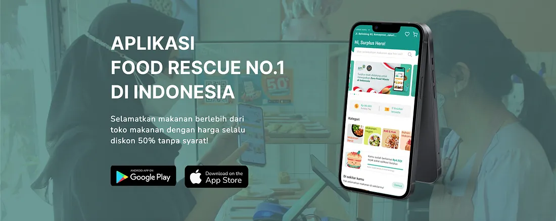
Surplus is an Indonesian food rescue platform connecting users with restaurants, cafes, and hotels that have surplus food available at a discount. The mission is sustainability: reduce food waste, give users access to quality meals at lower prices, and help food businesses recover value from inventory that would otherwise be thrown out.
The product works. Users love the concept. But there was a conversion gap that kept widening, and research pointed to one specific friction point: the restaurant profile page.
My Role
UX Designer responsible for user research, problem framing, redesign, prototyping, and usability validation.
🎯 The Goals
Two business objectives drove this project:
-
Improve conversion ratio. Users were browsing but not completing transactions at the rate the business needed. The gap between “I like this restaurant” and “I just bought from them” was too wide.
-
Improve discoverability and retention. Users were finding restaurants they liked but had no mechanism to stay connected. No follow. No notification. No reason to come back unless they happened to open the app at the right moment.
Both goals pointed to the same design gap: the restaurant profile had no relationship layer. It was a menu page, not a connection point.
🔍 User Research and Analysis
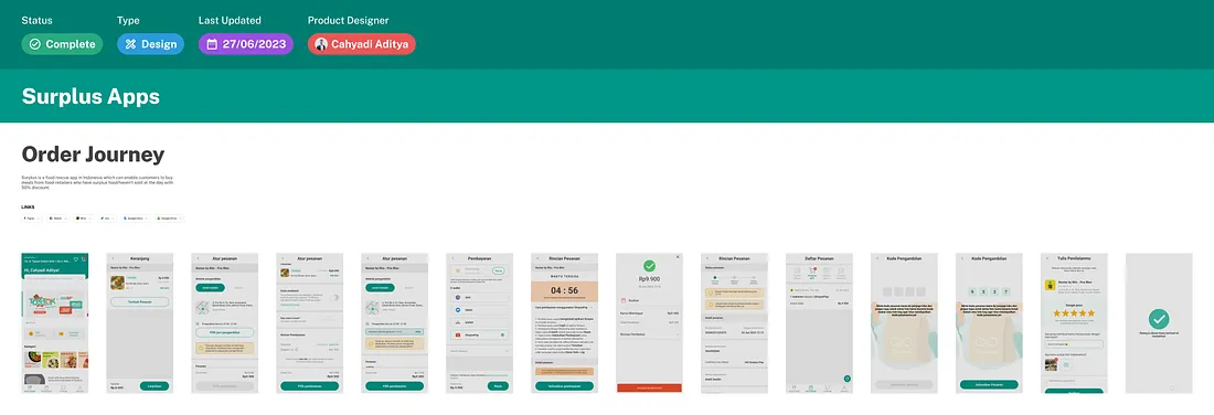
Order Journey — Surplus
We ran a combination of user surveys and 1-on-1 interviews. The data was clear on one point that changed the direction of the entire project.
4 out of 5 users said the primary appeal of Surplus is getting discounted, quality food from good restaurants and 5-star hotels. The food itself, specifically its origin and perceived prestige, is the core draw.
This reframed everything. Users are not just hunting for cheap food. They are hunting for specific restaurants they trust, at a price that feels like a win. The product is aspirational, not just economical.
Three additional patterns emerged from the interviews:
-
Supply scarcity is the real friction point. Surplus food is limited by nature. Availability windows are short. Users who checked the app too late, after their preferred restaurant sold out, had no way to avoid that outcome again. They were playing a guessing game with their time.
-
Manual checking is the current workaround, and it is failing. Without notifications, users had developed habits of opening the app repeatedly throughout the day, hoping to catch new listings. This behavior is unsustainable. It trains users to associate the app with disappointment more often than success.
-
The demand for personalized, real-time updates is high and unmet. Every interview surfaced some version of the same request: “Just tell me when my favorite restaurant has something available.” Nobody was asking for a feature they did not understand. They were describing a feature that did not yet exist.
The research gave a clear direction: build a Follow Restaurant mechanic, and redesign the restaurant profile to support the relationship users were already trying to have with these businesses.
📝 Design Solutions
Two focused changes to the restaurant profile page.
Solution 1: Redesigned Restaurant Profile Layout
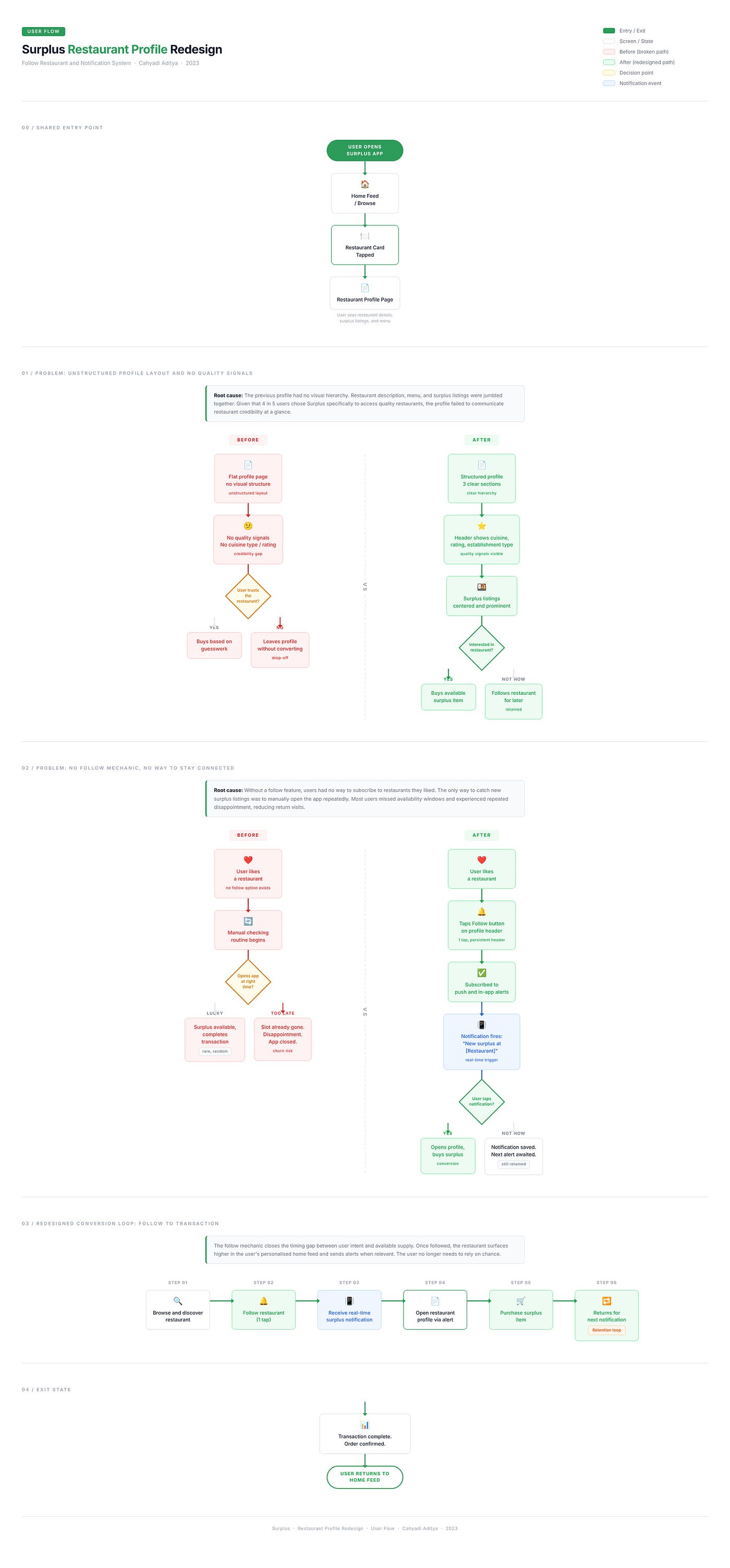
The problem with the previous layout: Information was unstructured. Restaurant description, menu items, and available surplus listings were not clearly separated. Users had to work to understand what was available, how much was left, and whether this restaurant was even worth their attention.
The redesign: Clear visual hierarchy with three distinct sections: restaurant identity and description at the top, current surplus listings in the middle, and the full menu below. Each section serves a different user need: orient, decide, explore.
The restaurant header was elevated to communicate quality signals immediately: cuisine type, rating, location, and the type of establishment (café, fine dining, hotel kitchen). Given that the primary appeal for 80% of users is the origin of the food, these signals needed to be prominent, not buried.
Solution 2: Follow the Restaurant and Notification System
The problem with the current state: No follow mechanic existed. Users could not subscribe to a restaurant. They had no way to receive alerts when new surplus listings appeared or when discounts dropped.
The redesign:
A prominent Follow button on the restaurant profile, accessible with one tap. When a user follows a restaurant, they opt into two types of alerts: push notifications for new product availability and in-app notifications for discount events.
The notification design was built around relevance, not volume. Users receive alerts only for restaurants they have explicitly chosen to follow, reducing noise and increasing the signal value of each notification. A followed restaurant in the app also surfaces higher in the user’s personalized feed.
The mechanic is intentionally simple. Follow. Get notified. Show up when the food is available. This closes the gap between discovery and transaction that the research identified as the core conversion problem.
Wireframe to High-Fidelity
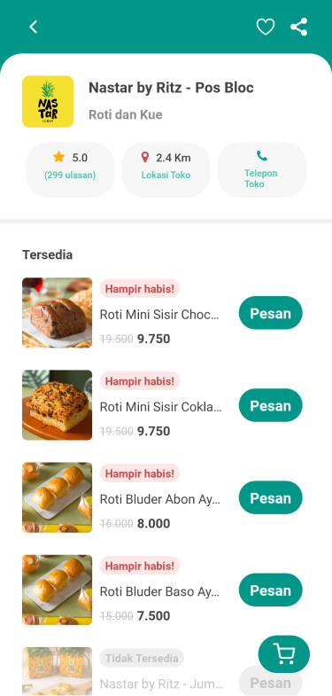
The wireframe phase focused on validating the information hierarchy and the placement of the Follow button before committing to visual design. Key decision from wireframing: the Follow button needed to live in the persistent header, not scroll away with the content. Users needed to be able to follow a restaurant at any point in their browsing, not only after reading the full profile.
Surplus Restaurant Profile
Wireframe
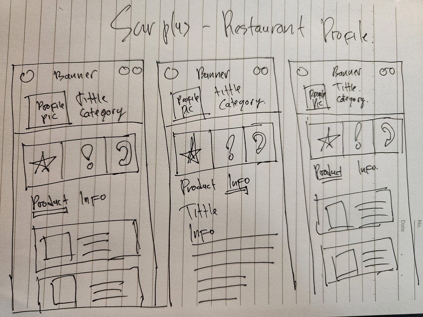
Wireframe — Surplus Restaurant Profile
Design
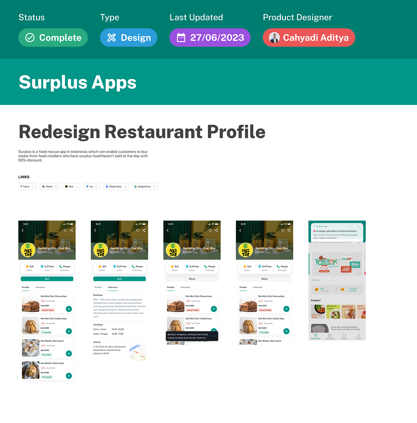
Prototype
📈 Outcome
The redesigned profile and Follow feature were validated through usability testing with active Surplus users.
The results confirmed the research hypothesis. Users who had previously described their main friction as “I always miss the good stuff” responded positively to the Follow mechanic, describing it as “exactly what I needed” and noting that it removed the need to manually check the app throughout the day.
Engagement with the restaurant profile page increased. Users spent more time with the description and menu sections, indicating that the cleaner layout encouraged exploration rather than quick-exit behavior.
The ratio of users who followed a restaurant and then completed a transaction within 48 hours was meaningfully higher than baseline browse-to-purchase rates, validating that the notification system was doing its intended job: shortening the window between intent and action.
🏁 Conclusion and Takeaway
The Surplus restaurant profile redesign was fundamentally about one thing: giving users a way to maintain a relationship with the restaurants they already liked.
The food rescue model creates an inherent scarcity dynamic. That scarcity is what makes the deals valuable, but it also creates a timing problem. The Follow feature turns that timing problem into an advantage: instead of users having to be in the right place at the right time by chance, the product brings the right moment to them.
The design principle that drove every decision: The user already knows which restaurants they want. Stop making them work to stay connected to those restaurants.
What I would explore with more time:
- A “followed restaurants” dashboard showing upcoming availability forecasts
- Notification preference controls so power users can manage alert frequency
- Social signals on restaurant profiles showing how many Surplus users follow a given restaurant, adding a trust layer for new users
📌 Disclaimer: This case study reflects my personal design process and perspective, created for educational purposes. Some details, including internal data, business metrics, and specific client information, are not disclosed for confidentiality reasons. All views expressed are my own.
💬 Let’s Connect Have feedback or thoughts on this case study? I’d love to hear from you, feel free to leave a comment below. For a discussion, you can reach me directly via Telegram or connect with me on LinkedIn . Thank you for reading.
Tags: UX Design · Product Design · Food Tech · Mobile App · Case Study · Surplus