UX Case Study: How I Helped Spotify Users Stop Losing Focus While Working
Picture this: it’s 2PM, you have a deadline in two hours, and you just spent the last fifteen minutes skipping songs instead of finishing your work.
That is not a music problem. That is a design problem.
Spotify already knows that 35% of its usage happens during productive activities: work, study, exercise. But the app was not built for that context. It was built for listening, not for helping users stay in flow. The moment a track breaks the mood, the user picks up their phone, starts browsing, and the session is over.
This project was about closing that gap: two new features designed to keep users in their work session, without breaking it.
💭 Context
This was a personal project exploring how Spotify could better serve users during productive work and study sessions. The design covers two new features within the existing Spotify mobile app: Vibe The Place and the Pomodoro Timer .
My Role: UX Designer, end-to-end. Research, wireframing, high-fidelity design, and usability testing.
Tools used: Figma, Notion, Miro, Maze (usability testing)
👤 Who This Was Designed For
Two distinct personas shaped every decision in this project.
Dennis Wijaya, 30, Web Application Developer. Dennis is a programmer living in Jakarta, married, with a demanding schedule built around online meetings and deep focus work. He is highly digitally literate, comfortable across IT, software, and mobile apps. His pain point is specific: he needed a flexible way to stay productive while listening to music, without being pulled out of his workflow to manage playback. His favorite apps include Spotify, which he uses heavily during work hours.
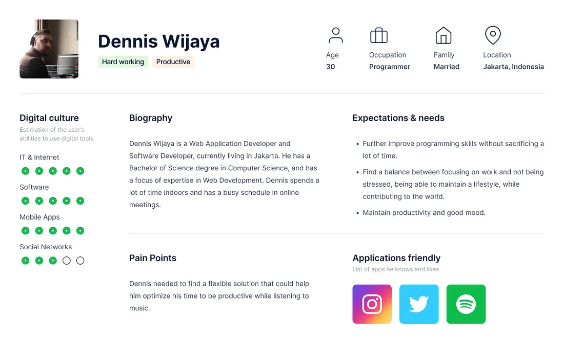
Persona Dennis Wijaya — Apps developer
Afrilla Melati, 24, Architect. Afrilla studied at ITB and built her professional career across London, Denmark, and Japan before founding her own studio. She is creative, curious, and equally comfortable in structured work and free exploration. Her pain point is atmospheric: when she is stuck or bored, she needs an environment that matches the feeling she wants to create. Music is how she shifts her mental state. She uses Spotify, Instagram, and TikTok.
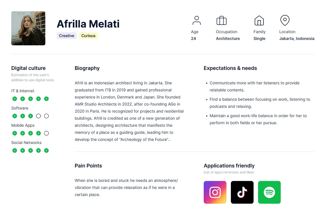
Persona Afrilla Melati — Architect
Dennis represents the efficiency seeker: someone who wants productivity tools that do not interrupt the work.
Afrilla represents the atmosphere seeker: someone who wants the music to set the scene before the work even begins. The two features map directly to these two modes.
🏋🏻 The Problem
Spotify’s current home screen serves a general listening use case. For productive users, this creates two friction points that the design set out to fix.
Friction point 1: No curated environment for work. Users like Afrilla who want music that matches a specific place, mood, or atmosphere have no shortcut. They browse, search, and often settle for something close enough, but not quite right. The decision process itself breaks focus before work has even started.
Friction point 2: No time structure inside the listening session. Users like Dennis who follow structured work-rest cycles (Pomodoro or similar) have to manage their timer externally, through a separate app or physical timer. Spotify plays continuously, indifferent to whether the work session has ended. There is no connection between the music and the work rhythm.
📝 Research Approach
Three methods:
Usability testing on the existing Spotify app to understand where the current interface fell short for productive use cases. How did users find music for focused work? How did they manage their listening when switching between work and rest?
Desk research on productivity listening behavior, Pomodoro method adoption, and ambient music as a focus tool. The 35% usage-during-productive-activities figure was the anchor that justified this as a real, underserved use case.
Gap analysis mapping what Spotify currently offers against what Dennis and Afrilla actually needed. The gap was clear: the features existed to support general listening, not productive listening.
📱 Design Solution
Two features. One entry point: a new “Productive with music” section surfaced directly on the Spotify home screen, giving both features immediate visibility without requiring users to search for them.
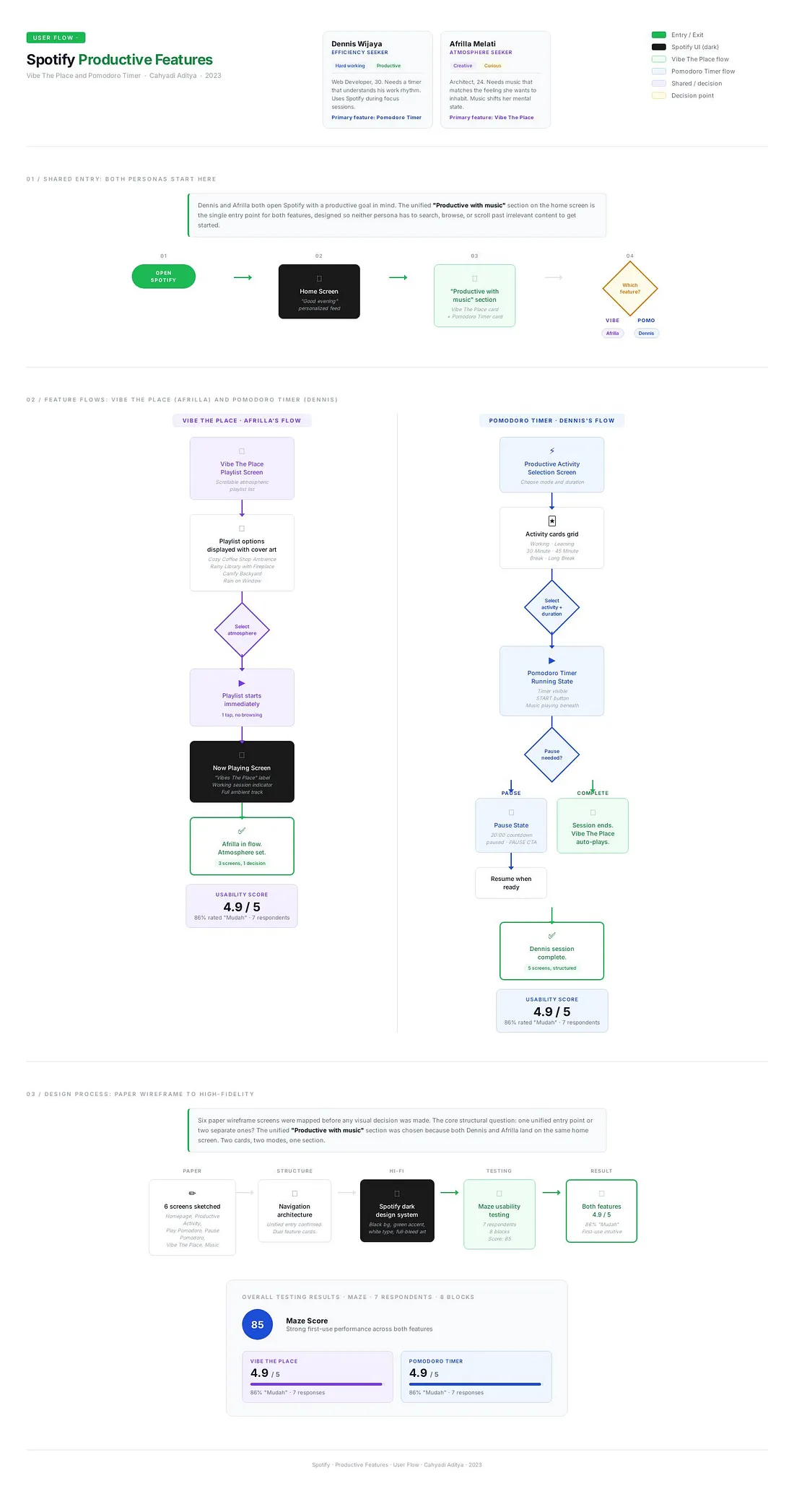
User Flow
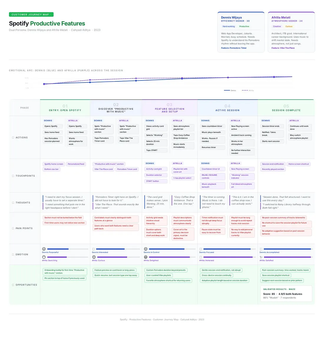
Customer Journey Map
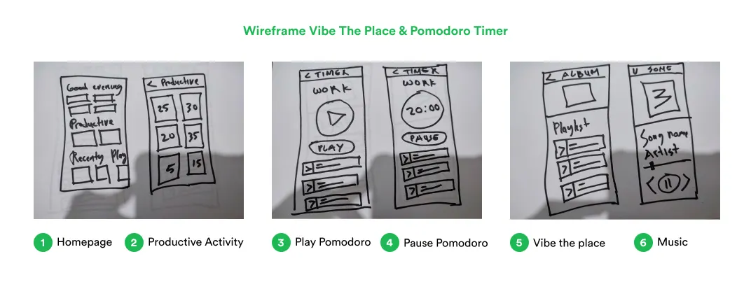
Low-fidelity wireframe
Feature 1: Vibe The Place
The problem it solves: Finding the right atmospheric music requires browsing, which breaks focus before work starts.
How it works: Vibe The Place is a curated playlist feature built around place-based atmosphere rather than genre or mood. From the home screen, users tap into the Vibe The Place section, select a playlist tied to a specific environment (Cozy Coffee Shop Ambience, Rainy Library with Fireplace, Camfy Backyard, Rain on Window), and the music starts immediately, matched to the atmosphere they want to inhabit while working.
The key design decision was removing the selection friction. Instead of a search bar, users see a pre-curated list of place-based playlists with cover art that communicates the atmosphere visually. The choice is made in one tap.
The flow: Home screen with “Productive with music” section → Vibe The Place playlist screen (scrollable list of atmosphere playlists) → Now Playing screen with ambient track running and a “Working” session indicator. Three screens, one decision, zero browsing.
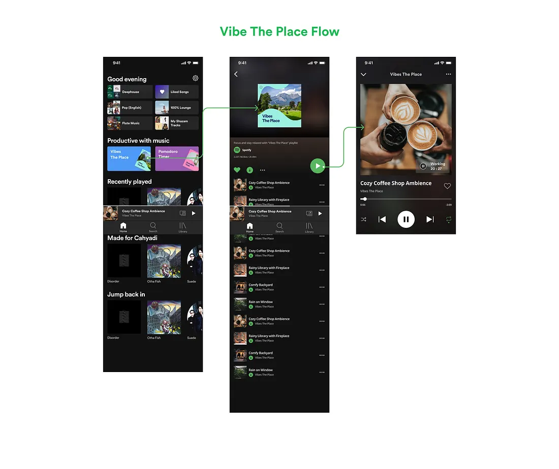
Feature I — Vibe the place
Feature 2: Pomodoro Timer
The problem it solves: Productive users follow work-rest cycles, but Spotify plays continuously and has no awareness of that structure.
How it works: The Pomodoro Timer integrates a session timer directly into the Spotify listening experience. From the home screen, users tap Pomodoro Timer, select their activity type (Working, Learning), and their session length (25, 30, 45 minutes for work blocks; Break and Long Break for rest). The timer starts alongside the music. A countdown is visible during the session. When the session ends, Spotify can respond accordingly.
The activity selection screen uses a visual card grid rather than a dropdown: six options (Working, Learning, 30 Minute, 45 Minute, Break, Long Break) displayed as tappable cards with imagery that communicates the session type. This was a deliberate decision to make the selection feel like choosing a mode, not filling a form.
The flow: Home screen → Productive Activity screen (select activity type and duration) → Pomodoro Timer running (timer visible, START/PAUSE controls, music playing underneath) → Pause state (20:00 countdown paused, PAUSE button active) → Vibe The Place now playing after session completes. Five screens, structured from intent to execution.
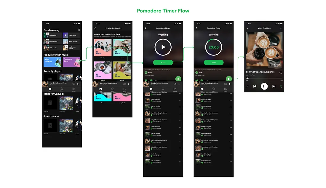
Feature II — Pomodoro timer
✏️ Process: From Paper to Pixels
The design started with six paper wireframe screens mapped across both flows:
- Homepage with “Productive with music” entry point
- Productive Activity selection
- Pomodoro Timer playing state
- Pomodoro Timer paused state
- Vibe The Place playlist screen
- Music now-playing screen
The paper wireframes clarified the navigation structure before any visual decisions were made. The core question was whether both features needed separate entry points or a unified one. The unified “Productive with music” home section was chosen because Dennis and Afrilla would both land there, and the two cards (Vibe The Place / Pomodoro Timer) communicated the two distinct modes without requiring explanation.
High-fidelity execution followed Spotify’s existing dark design system: black backgrounds, green accents, white type, full-bleed album art as the dominant visual in the now-playing state. The goal was for both features to feel native to Spotify, not like add-ons.
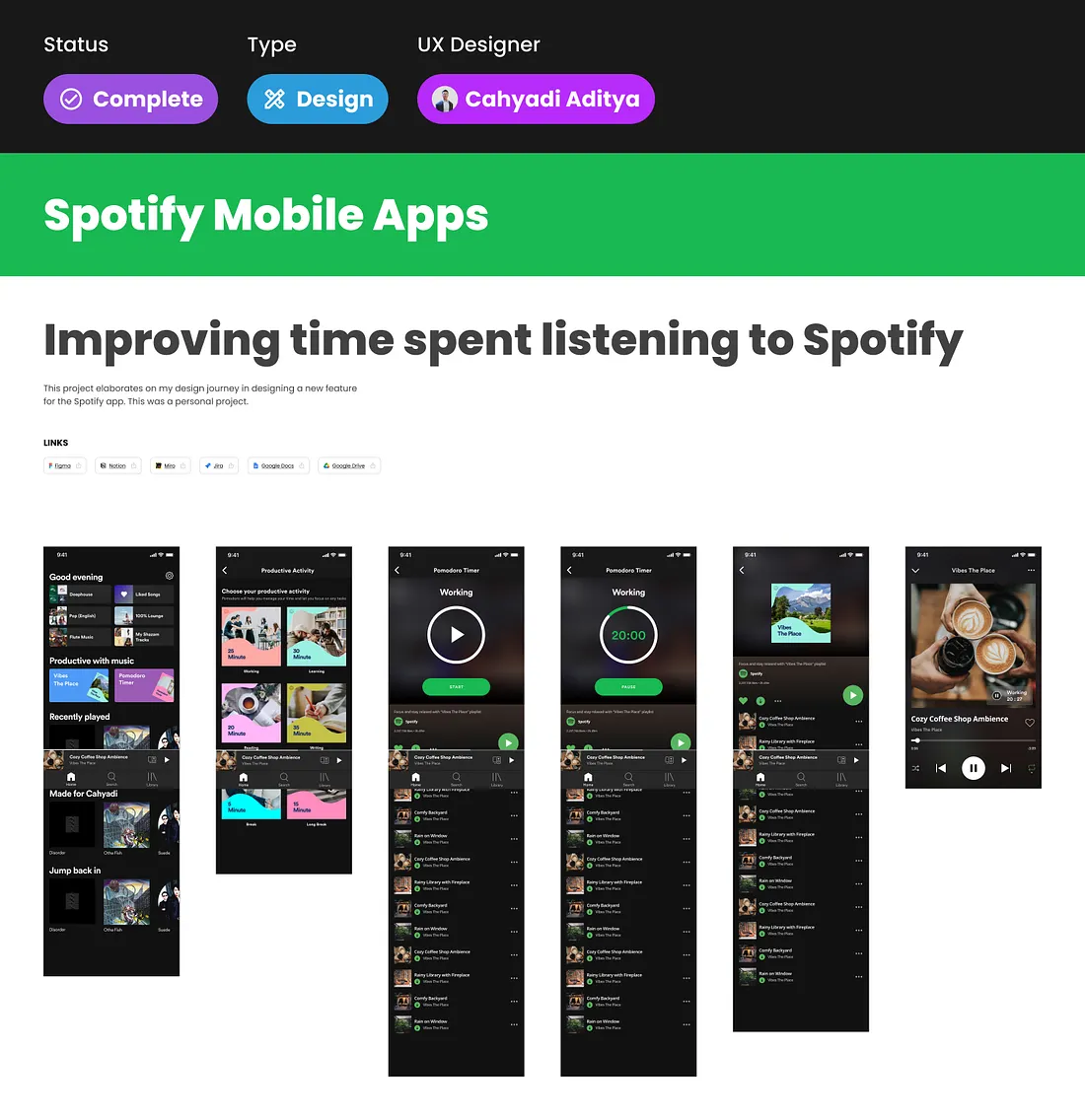
High-fidelity design
Prototype
🧪 Usability Testing
Testing was conducted via Maze , with 7 respondents and 8 test blocks.
Overall Maze score: 85.
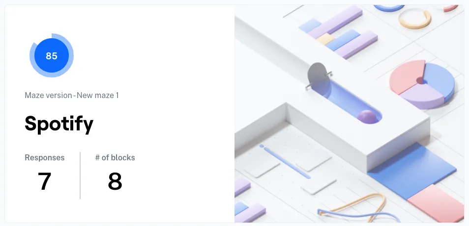
Responses
The two key usability questions produced identical results:
“Bagaimana pengalaman kamu memilih lagu di playlist Vibes the Place?” 7 responses. Average score: 4.9 / 5 . 86% rated it “Mudah” (Easy). 14% rated it one step below.
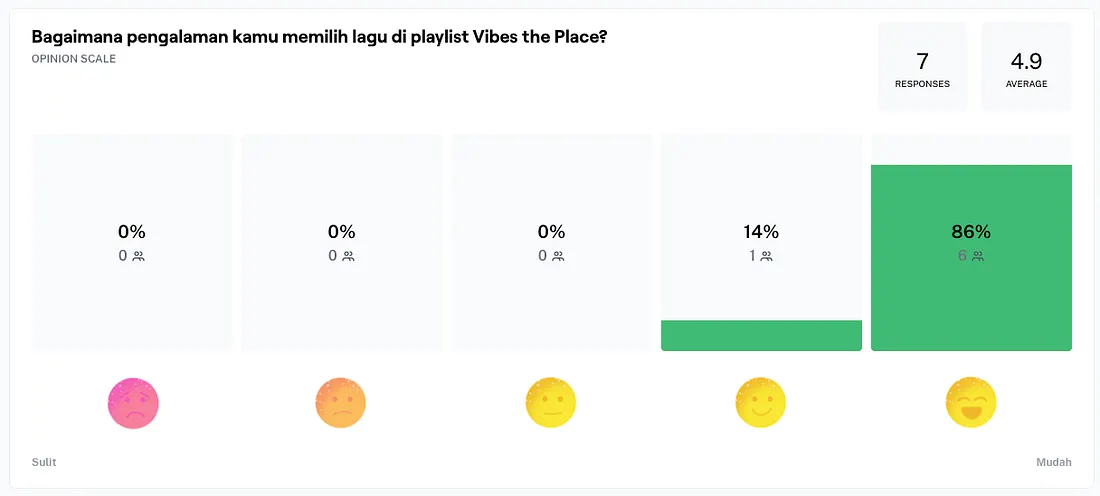
Vibes The Place feature
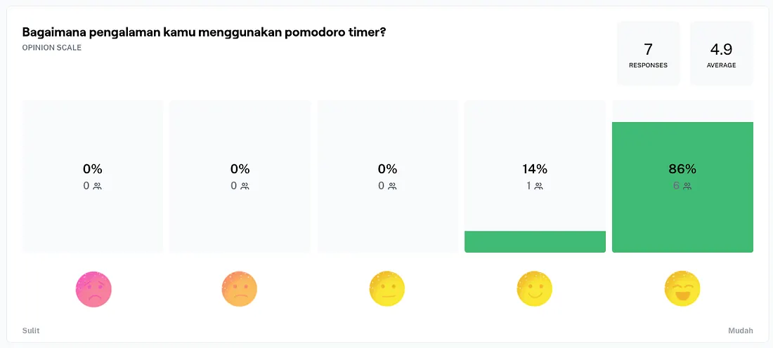
“Bagaimana pengalaman kamu menggunakan pomodoro timer?” 7 responses. Average score: 4.9 / 5 . 86% rated it “Mudah” (Easy). 14% rated it one step below.
Pomodoro Timer feature
Both features scored identically: 4.9/5 , with the overwhelming majority finding both flows straightforward on first use. The 14% who rated slightly below “Mudah” on both metrics is consistent, suggesting a small segment of users needed slightly more orientation before the interaction felt effortless. This points to one specific area for iteration: the entry point on the home screen could use a brief label or indicator to help first-time users understand what “Productive with music” offers before they tap in.
💼 Outcome
The usability results validate the core design hypothesis: that productive listening features, when designed with the right session structure and minimal friction, feel intuitive on first contact.
A Maze score of 85 with 7 respondents and 4.9/5 ease ratings on both primary tasks is a strong signal. Neither feature required explanation to use. The flows were short enough to complete without cognitive overhead, and the visual design was consistent enough with Spotify’s existing patterns that users did not need to relearn the interface.
The Pomodoro Timer’s activity selection screen was the most deliberate design decision in the project. It could have been a dropdown or a text input. The card grid approach was chosen because it made the selection feel like choosing a state of mind, matching how Dennis and Afrilla actually think about their work sessions.
📋 Conclusion
Spotify’s listening data already knew that productive users were a significant segment. The design gap was that the product was not built to serve that context intentionally.
Two features, one unified entry point, and a clear connection between music and work structure: that was enough to close the gap in a way that felt native to Spotify’s existing workflow.
The design principle: When you design for a specific context, you do not need to add complexity. You need to remove the friction between what the user wants and what the interface offers. Dennis wanted a timer that understood his rhythm. Afrilla wanted an atmosphere she could step into. Neither asked for a new app. They asked for Spotify to understand why they were listening.
What I would explore with more time:
- Adaptive playlist suggestions based on Pomodoro session length and historical listening
- Cross-device continuity: timer state persists when switching from phone to desktop
- Post-session summary: how long you worked, what you listened to, and a shortcut to save the session playlist
📌 Disclaimer: This case study reflects my personal design process and perspective, created for educational purposes. Some details, including internal data, business metrics, and specific client information, are not disclosed for confidentiality reasons. All views expressed are my own.
💬 Let’s Connect Have feedback or thoughts on this case study? I’d love to hear from you, feel free to leave a comment below. For a discussion, you can reach me directly via Telegram or connect with me on LinkedIn . Thank you for reading.
Tags: UX Design · Product Design · Spotify · Productivity · Mobile App · Case Study · Pomodoro