When a Feature Exists But Nobody Uses It: A UX Fix for Deall Jobs
There’s a specific kind of product failure that doesn’t show up in crash logs.
The feature works. Engineers shipped it clean. QA signed off. It’s live.
And then nobody uses it.
Not because it’s broken. Because nobody noticed it was there.
That was exactly the problem we were solving at Deall Jobs.
💭 Context
Deall Jobs is Indonesia’s leading career platform, connecting talent with top companies through a curated, transparent hiring process.
In late 2022, the product team shipped a new B2B feature: the Customizable Candidate Tracker , a tool that lets HR teams track each candidate’s progress through their unique hiring pipeline. HRs could rename each pipeline step to match their internal process, and trigger automated case study delivery directly from the tracker instead of emailing candidates manually.
On paper, it solved a real pain point. In practice, almost no one was using it the way it was designed.
My Role
Product Designer, responsible for problem diagnosis, redesign proposal, and usability testing.
The Mandate
Identify why the feature wasn’t being used as intended. Propose solutions. Test them.
🏋🏻 The Problem (What We Actually Saw)
Two behaviors kept surfacing across user sessions:
Problem 1: HRs weren’t customizing the tracker. The whole value proposition of the feature was customization. But HRs were leaving the default step names untouched. Their hiring pipelines were getting tracked under generic labels that didn’t reflect how their teams actually worked.
Problem 2: HRs were sending case studies manually. The tracker had a built-in option to send case studies automatically. Nobody was using it. Instead, HRs were copy-pasting instructions into emails and messaging candidates one by one, which was the exact friction the feature was supposed to eliminate.
The initial assumption from the team was that HRs didn’t find the feature useful. The real answer turned out to be simpler and more fixable.
🔍 Research: Finding the Actual Root Cause
We ran 1-on-1 user interviews and observation sessions with HR professionals actively using the Candidate Tracker. No surveys. Direct observation of how they actually interacted with the interface.
Two root causes emerged clearly:
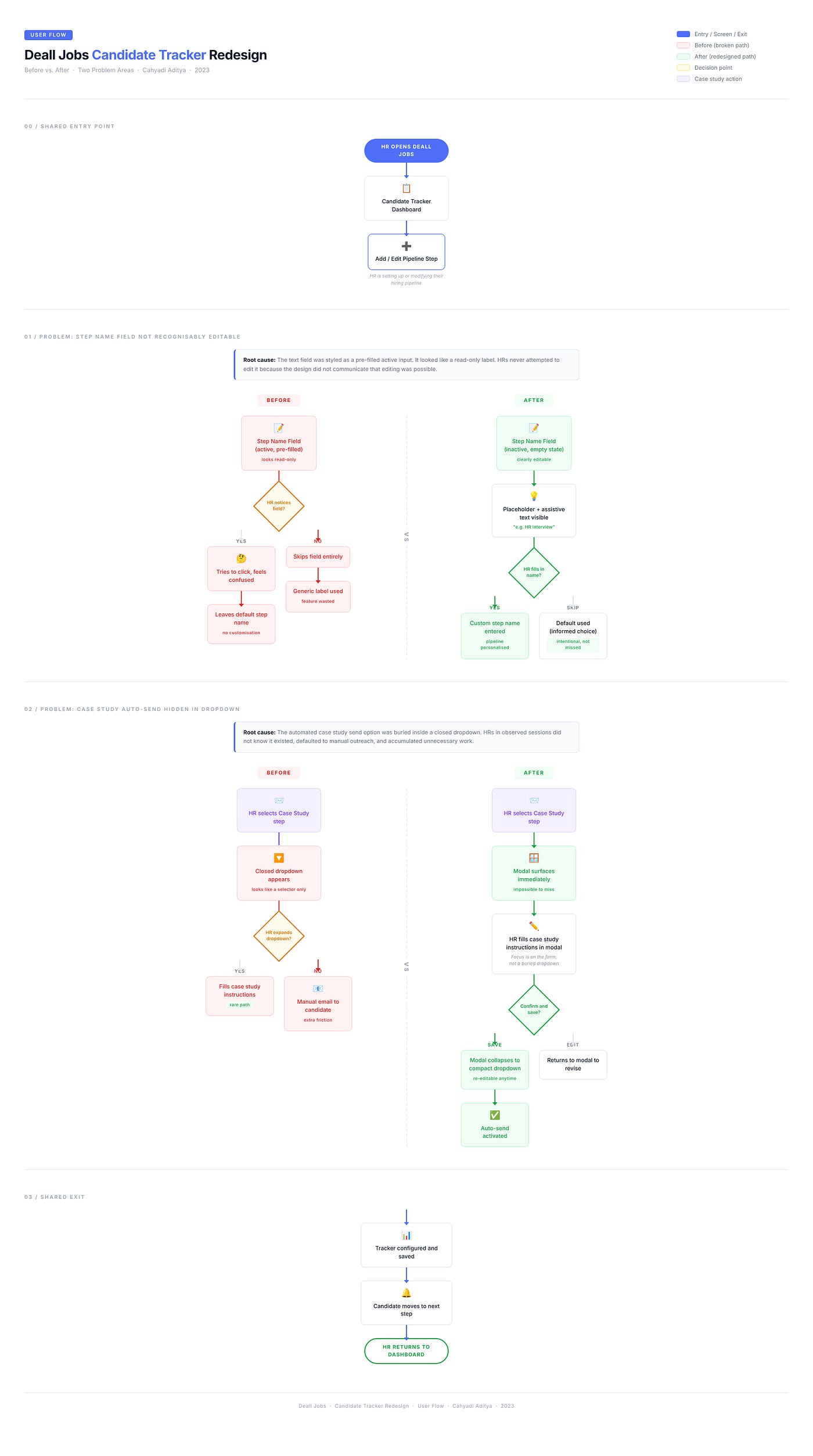
Root Cause 1: The editable field didn’t look editable. The step name text field was styled as an active, pre-filled input. To a first-time user, it looked like a read-only label. Nothing about its visual treatment signaled “you can change this.” HRs weren’t ignoring the customization feature. They genuinely didn’t know it existed.
One HR participant said she assumed the step names were fixed by the system and that she “wasn’t allowed to change them.”
This is a classic affordance failure. The component didn’t communicate its own capability.
Root Cause 2: The case study option was invisible until you already knew it was there. The automated case study delivery was tucked inside a closed dropdown that only appeared when HRs selected a specific pipeline step. For HRs unfamiliar with the feature, the dropdown looked like a confirmation selector, not an action trigger. They dismissed it, defaulted to their old manual workflow, and never looked back.
The feature wasn’t discoverable. Discoverability isn’t a nice-to-have. It’s the difference between a feature that ships and a feature that gets used.
📝 Design Solutions
Two targeted fixes. No full redesign. No scope creep.
Fix 1: Make the Editable Field Feel Editable
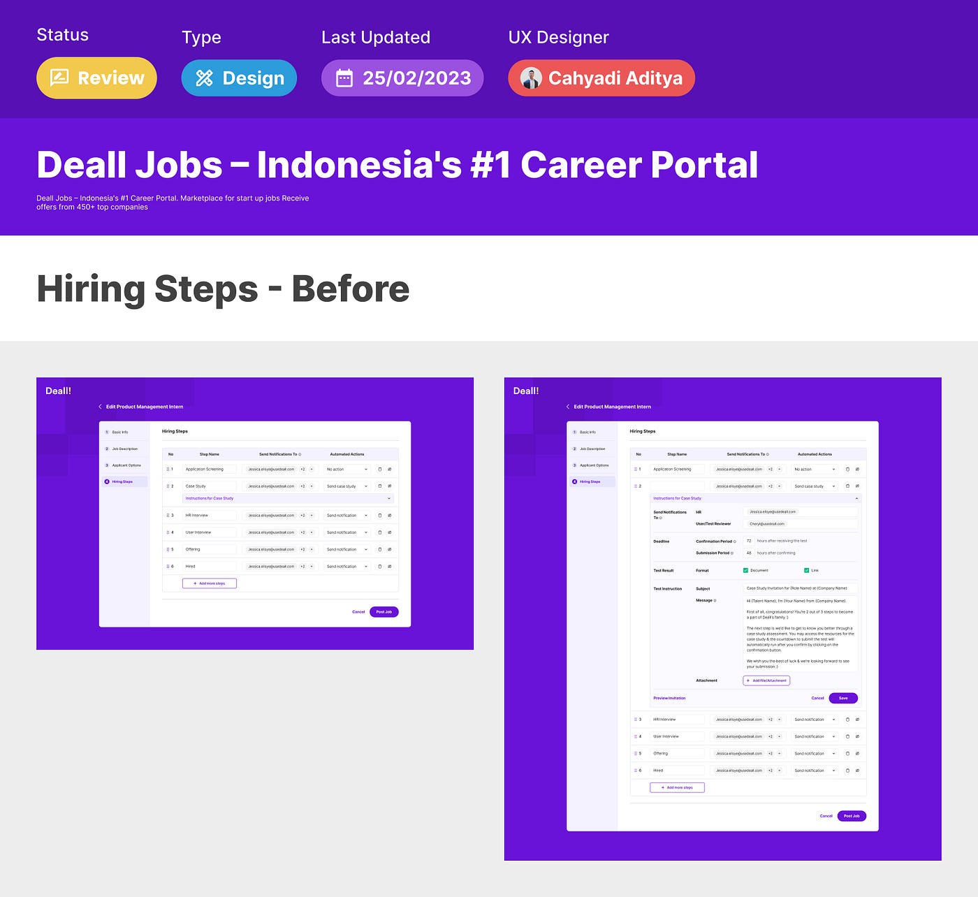
Before: The step name field was pre-filled with placeholder text styled identically to a completed input. Active state, no visual cue that it could be modified.
After: Redesigned to an inactive component state by default , with a clear placeholder and assistive text that reads as an invitation to customize. The field now communicates three things simultaneously:
- It is empty and waiting for input
- It can be personalized
- There is a suggested action (the placeholder text guides what to type)
The fix is purely visual. No new functionality, no backend changes. Just restoring the affordance the original design accidentally removed.
Why this works: Inactive/empty states are universally understood as editable. By starting the field visually empty with descriptive placeholder copy, we align with the user’s mental model of “empty field = fill this in.”
Fix 2: Make the Case Study Option Impossible to Miss
Before: Automated case study delivery lived inside a closed dropdown, hidden from view. HRs had to know to look for it. Most didn’t.
After: When an HR selects a pipeline step that involves a case study, a modal component surfaces immediately , foregrounding the case study details form. The HR is prompted to fill in the instructions right then , before proceeding. Once they save and confirm, the component collapses back into a compact dropdown for re-editing.
This changes the interaction model from opt-in discovery to intentional acknowledgment. The feature doesn’t hide in a menu. It presents itself at the moment of highest relevance.
Why this works: Modals interrupt the flow purposefully. In this context, that interruption is the point. An HR filling out a hiring step is the right moment to ask “do you want to attach a case study?” Surfacing it then is not intrusive; it’s contextually appropriate.
👨🏻💻 Validation
We brought the redesigned prototype back to the same HR participants for another round of usability testing.
The results were clear on both fixes:
- HRs immediately understood that the step name field was editable. Several started customizing it without any prompting.
- The modal for case study instructions was noticed, understood, and filled out correctly by all participants in the first attempt.
- Reported time spent on manual candidate outreach dropped significantly in simulated sessions. HRs described the automated send as “actually saving me steps I didn’t know I could skip.”
No confusion. No abandonment. The feature worked exactly as designed once the design made the feature visible.
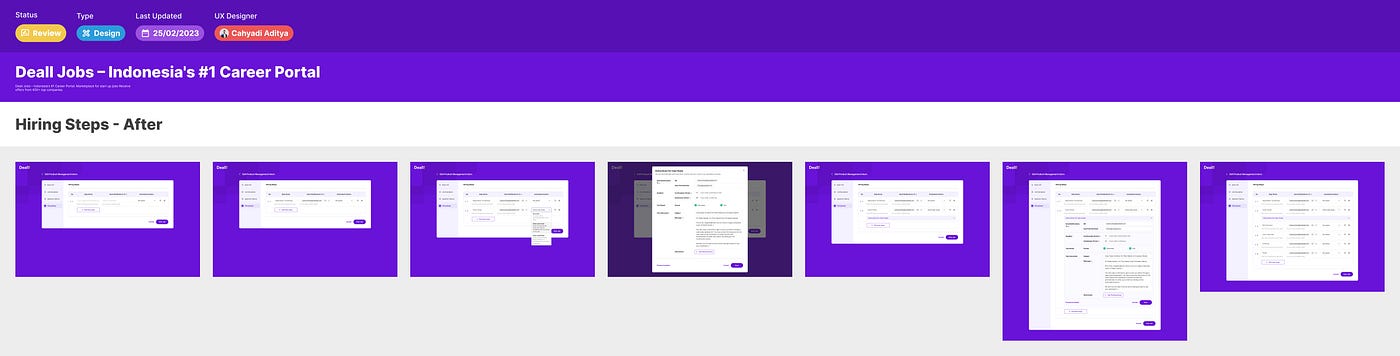
Proposed designs
Design
🏁 Conclusion & Takeaway
The Customizable Candidate Tracker wasn’t broken. It was invisible.
Two small, precise design fixes changed the adoption picture: restore the affordance of an editable field, and surface a high-value action at the right moment instead of hiding it in a menu. That’s it.
The broader principle: When users aren’t using a feature, the first question shouldn’t be “did we build the wrong thing?” It should be “do users even know this thing exists?”
Discoverability is not polish. It is a product strategy. A feature that no one finds is a feature that never shipped.
What I’d do with more time:
- Quantify the before/after on manual outreach volume with real usage data
- Run a longer observation study across HR teams with different pipeline structures
- Explore progressive disclosure patterns for the full tracker to prevent future discoverability gaps
📌 Disclaimer: This case study reflects my personal design process and perspective, created for educational purposes. Some details, including internal data, business metrics, and specific client information, are not disclosed for confidentiality reasons. All views expressed are my own.
💬 Let’s Connect Have feedback or thoughts on this case study? I’d love to hear from you, feel free to leave a comment below. For a discussion, you can reach me directly via Telegram or connect with me on LinkedIn . Thank you for reading.
Tags: UX Design · Product Design · B2B · HR Tech · Usability · Case Study · Deall Jobs